My deliverables
Responsive Design
UI Design
Interaction Design
My Role
UX Designer
Background
A project kicked off to redesign Rotary's two core properties, the public and member focused websites. In order to take on a project of this scale, we partnered with Viget Labs. Viget was selected because of their expertise in the nonprofit domain and the quality of their work. Viget and our internal team would work closely together to deliver improvements to both properties structure, functionality, and visual design. Please note, for this case study, I am focusing on the rotary.org homepage redesign.
The public website is highly trafficked, with around 10 million unique visitors over a seven month period. It serves as the public face for the Rotary brand and its offerings in the digital domain. Although the traffic was significant, there was a high bounce rate of approximately 58%. A portion of those bounces are from users navigating to complete a task. But still a strong indication the homepage is not serving its intended purpose. The site performance was also sluggish, with a 11 second average page load time — due to legacy backend issues.
Bounce Rate
Site visitors
Avg. Page Load Time
My Approach
01. Discover
Collect data, gain context, hear and empathize with what users are experiencing.
Stakeholder & SME Interviews
User Research
Analysis
02. Define
Synthesis of all research data into problems and solution hypothesis to be validated.
Research Insights
User personas
Success Metrics
03. Develop
Create and validate potential design solutions meet success criteria and objectives.
Wireframes & Prototypes
Stakeholder Validation
User Research Design
04. Deliver
Validate and refine with users until we arrive at build candidates.
User testing prototypes
Iterate & Refine
Dev Handover
01. Discover
The Current experience
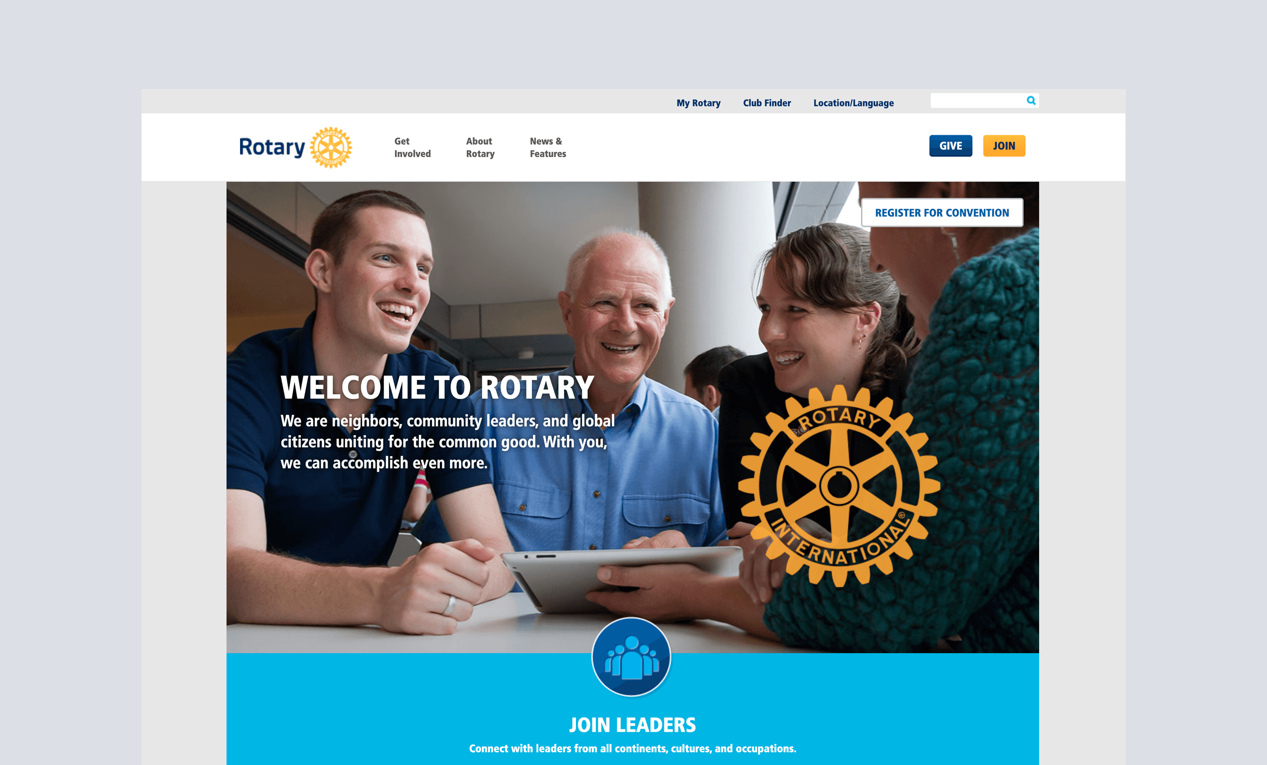
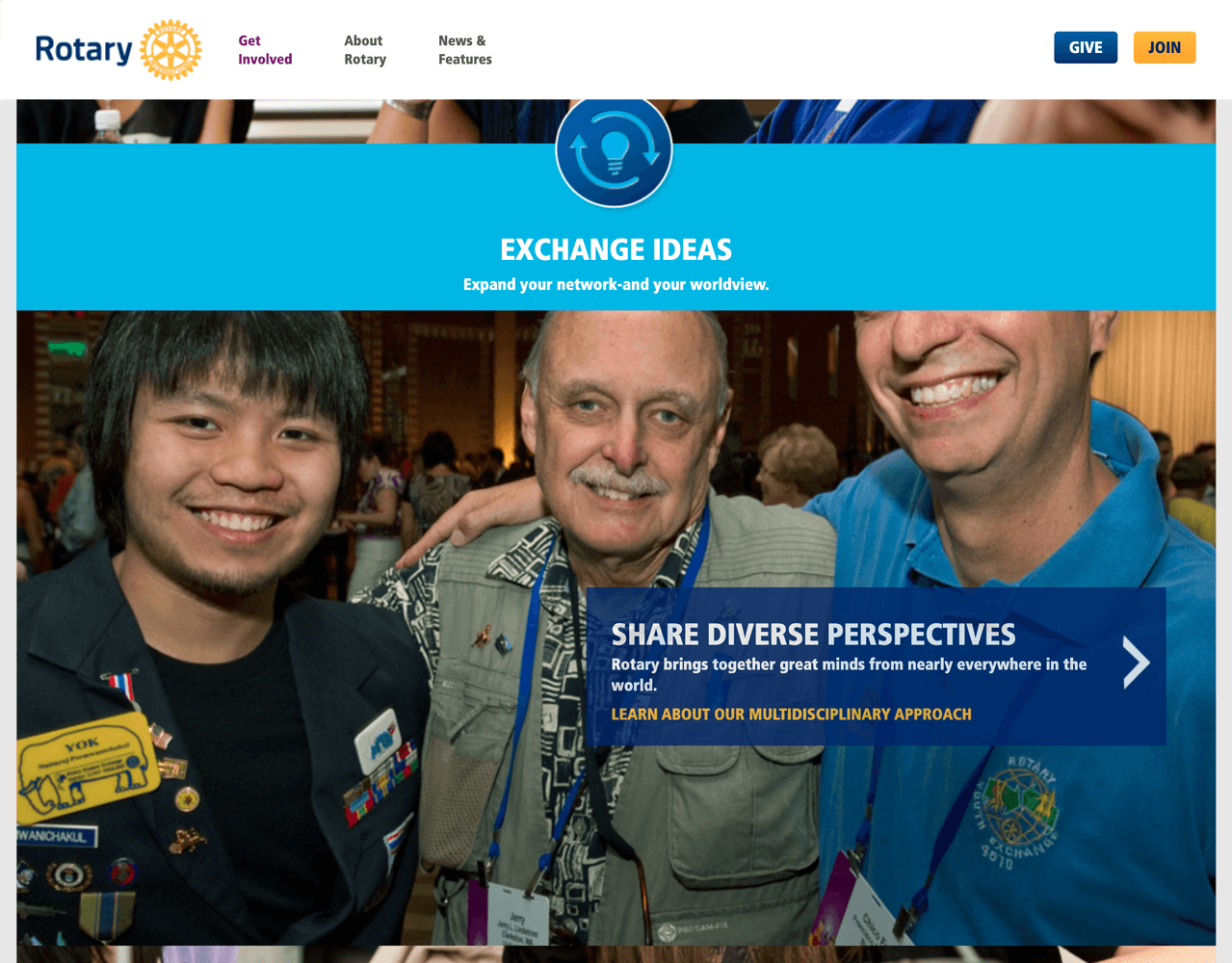
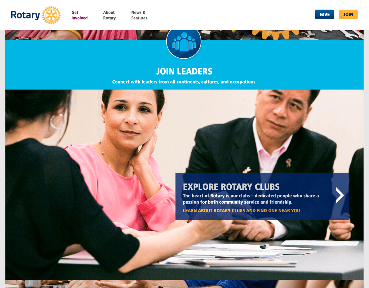
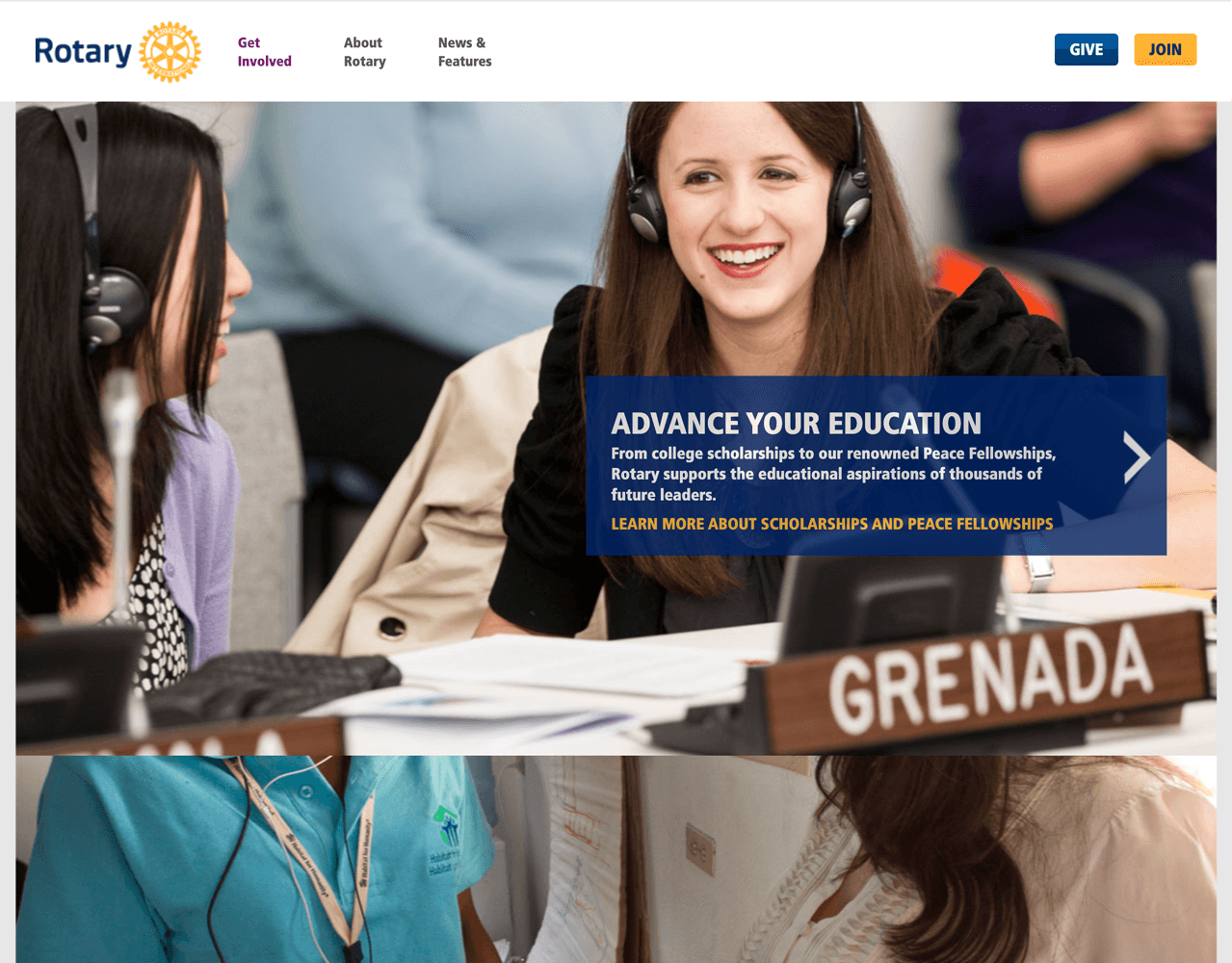
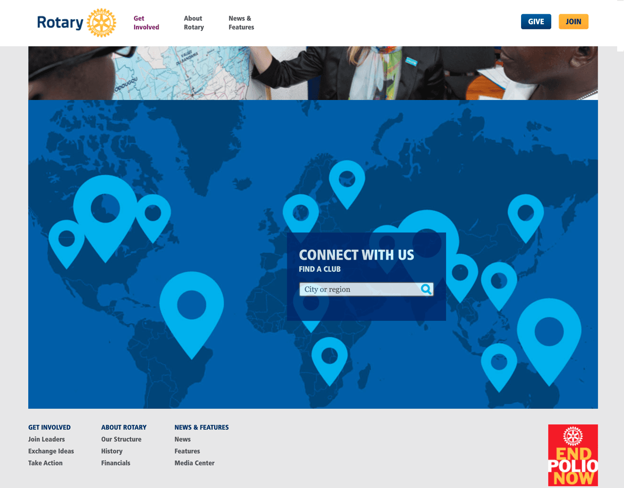
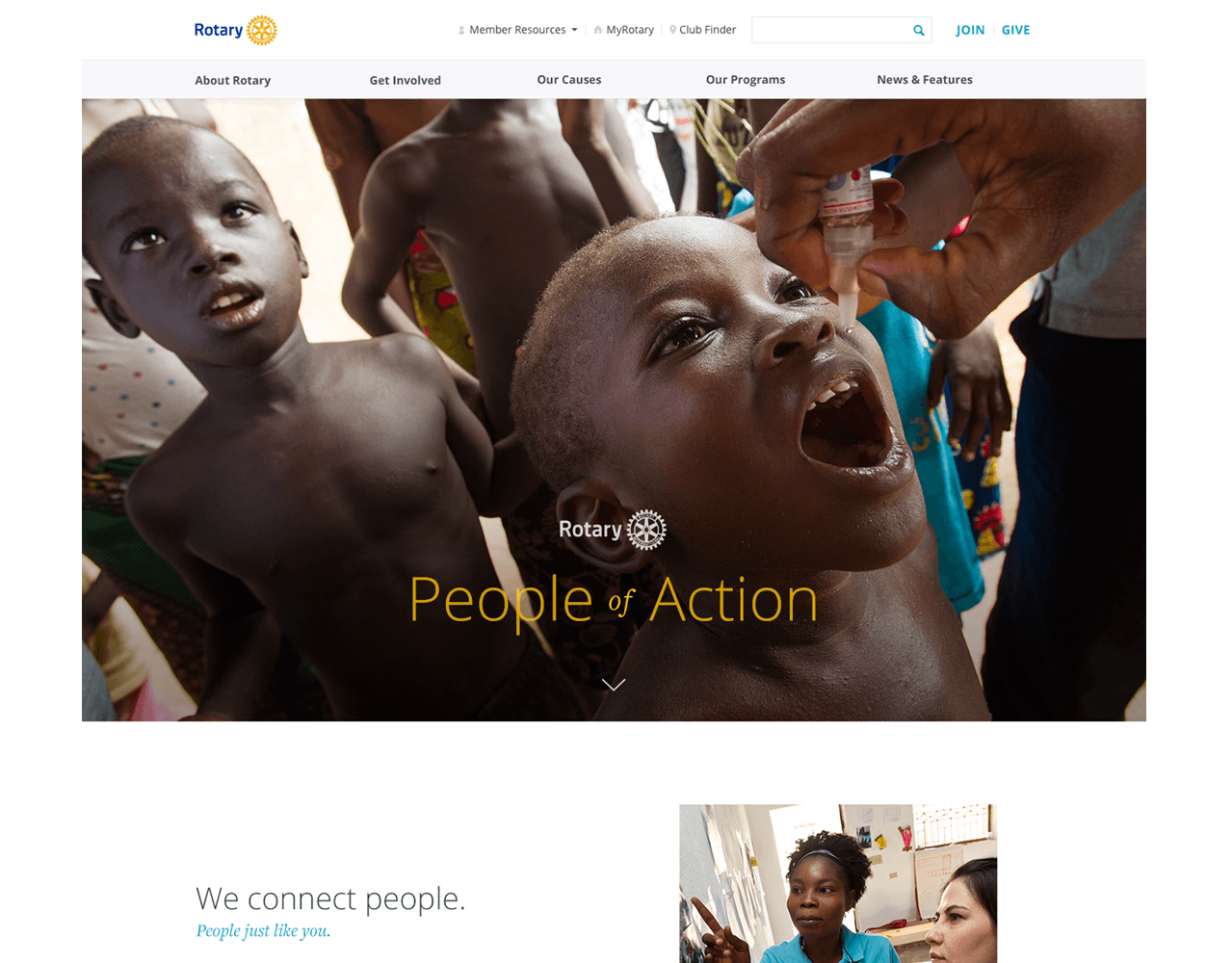
The current homepage was a stack of parallaxed photos with brief CTAs that serve to send visitors deeper into the site for more information. While well placed photos can be a powerful tool to connect with visitors, if too many are used, the impact is weakened. Additionally, the CTA sections were the only way users could get to more content about the subject. Also, there is a heavy use of internal-jargon terms as primary CTAs. For example, the CTA "Share Diverse Perspectives", is very difficult to intuit what you would find within — even with the section title "Exchange Ideas" as context.
repetitive & Hidden Navigation
You can see the length of the page and number of calls to action. Users would not intuitively know those CTAs are the only way to navigate to related content.
02. Define
Our Public website users
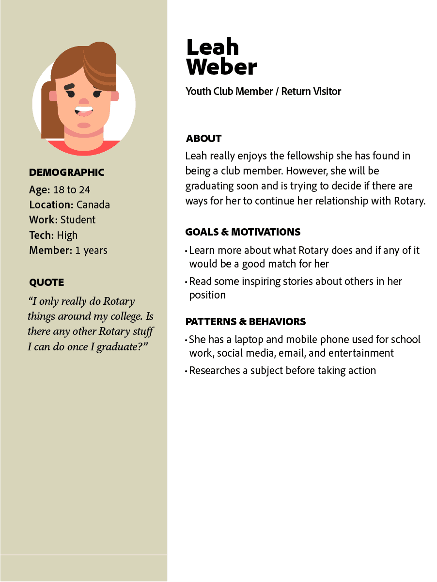
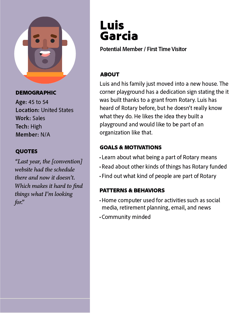
I created personas based on the two primary user groups based on project objectives. These were first time visitors, who were looking to learn what the core brand offerings are, and return visitors, who are open to deepening their relationship with Rotary.
measuring success
Reduce the bounce rate, increasing site traffic, and improve page load time were the core metrics used to measure project success. A reduction in bounce rate would show that users are finding the content engaging enough to stay. An increase to site traffic is linked to marketing efforts and possibly the new content SEO effectiveness. Lastly, lowering the page load time will vastly improve the overall experience. Stakeholders would also like to see greater activation with donations and join paths.
03. Develop
Developing Solutions
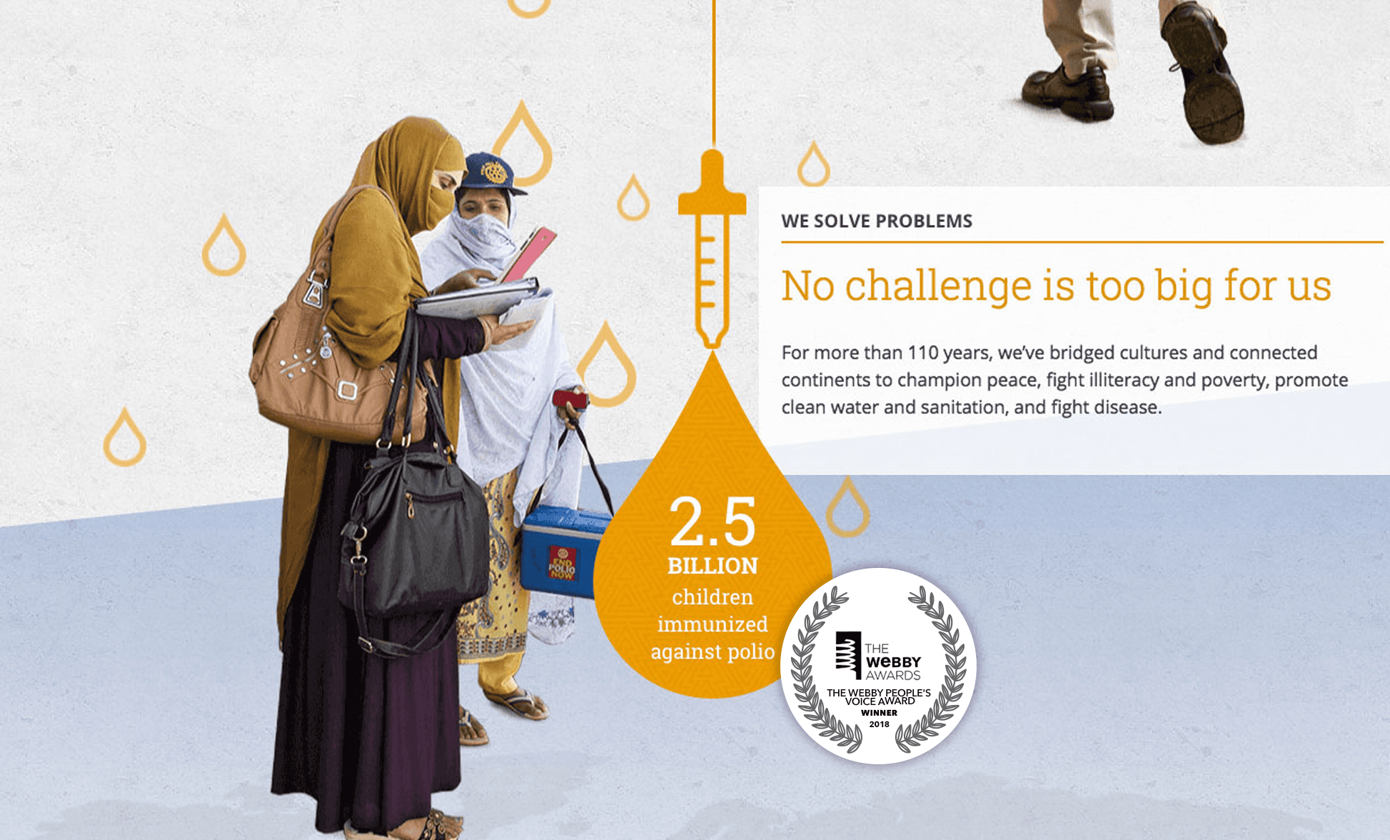
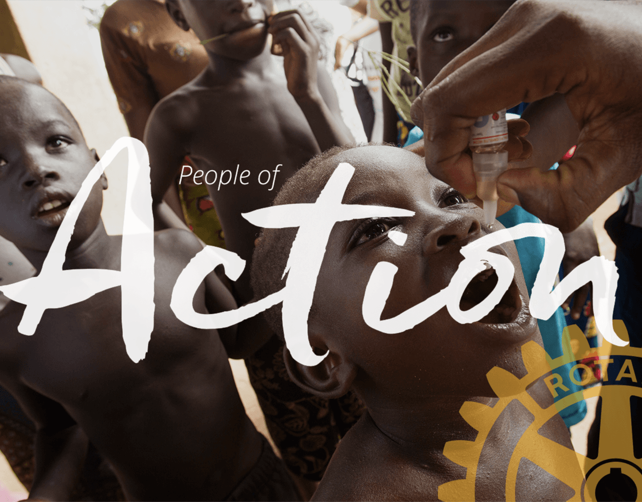
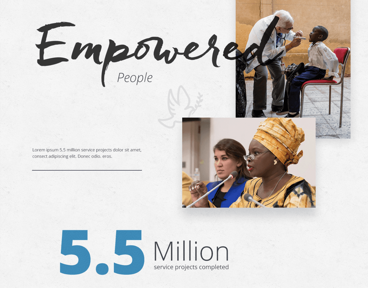
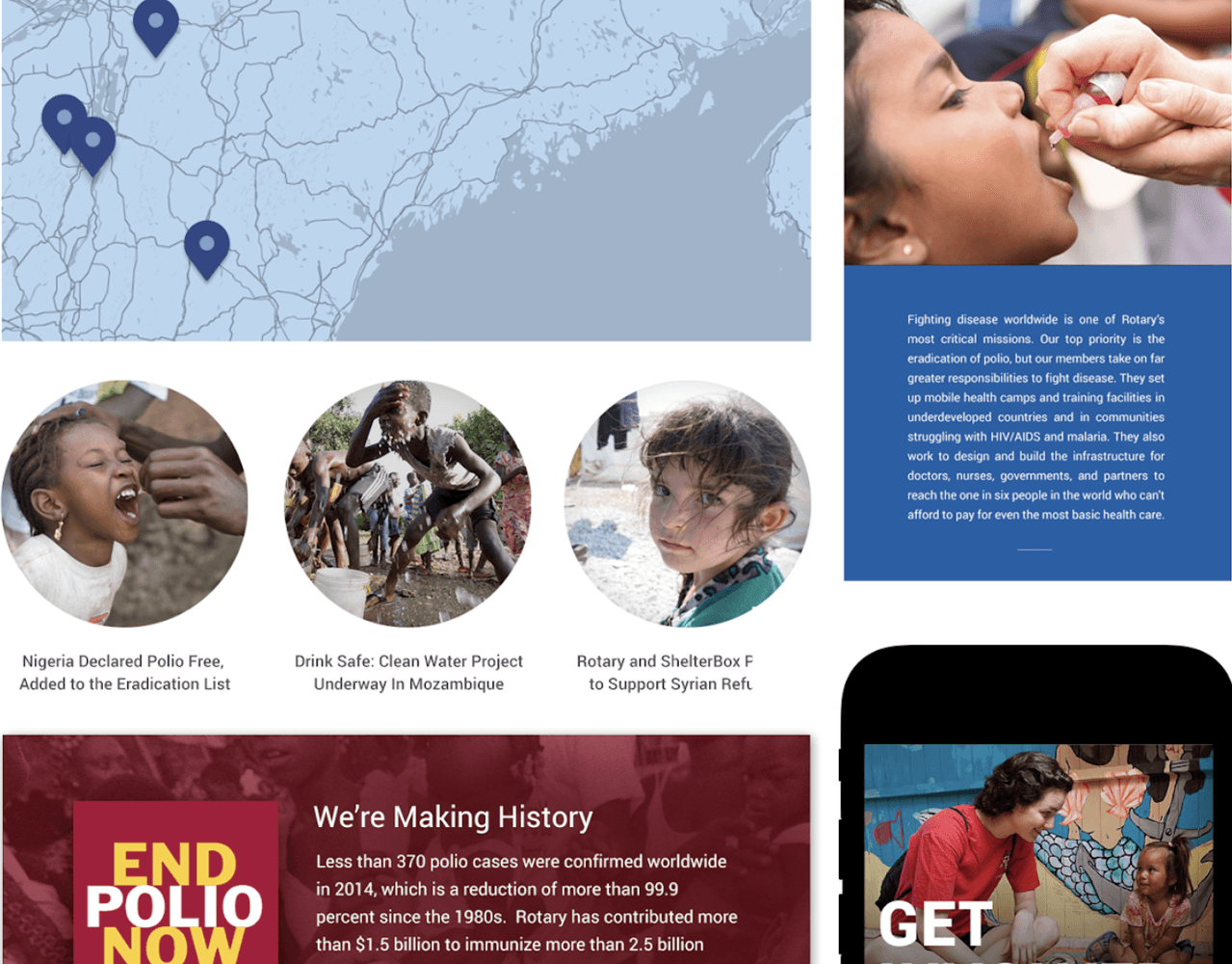
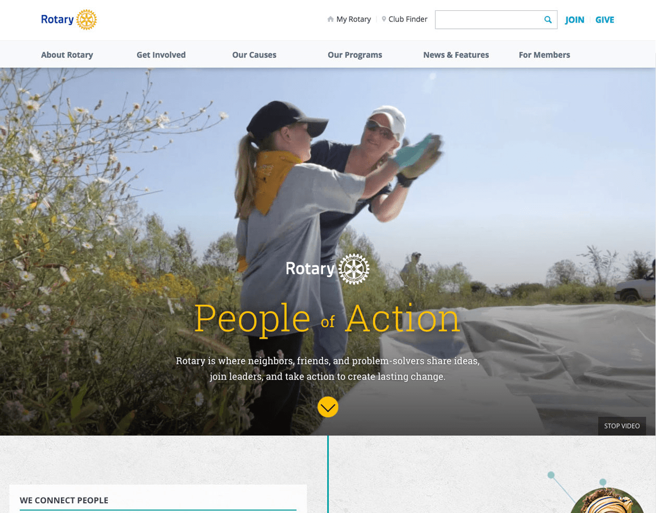
Viget and my design ideations focused on creating engaging elements, such as using an ambient video, bold photos, and design elements to establish visual themes. Due to conflicts in the project scope, Viget did not complete a homepage design. So, I took the lead and completed the iteration phase with an approved design.
A Note on Information Architecture and Navigation
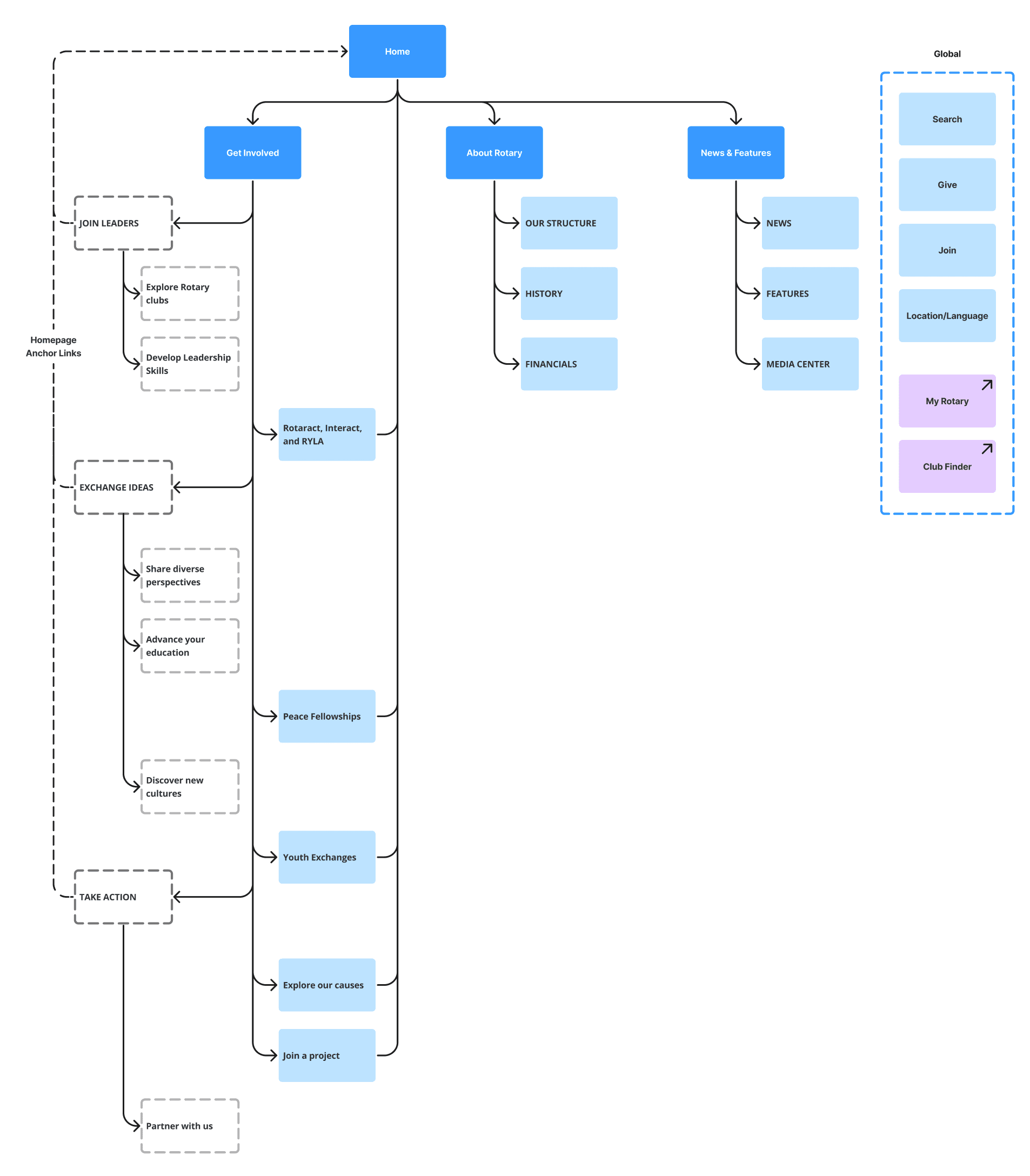
Part of telling a brand's story lies in the site structure and navigation. It may sound odd, but the way you organize and present your content communicates how you perceive and value it to visitors. With that in mind, the current public site had three primary navigational categories: Get Involved, About Rotary, and News & Features. The Get Involved dropdown displays mostly anchor links back a section on the homepage… where users could find links to a content page. Very confusing for users which made it hard to find anything that didn't fit the narrow section categories.
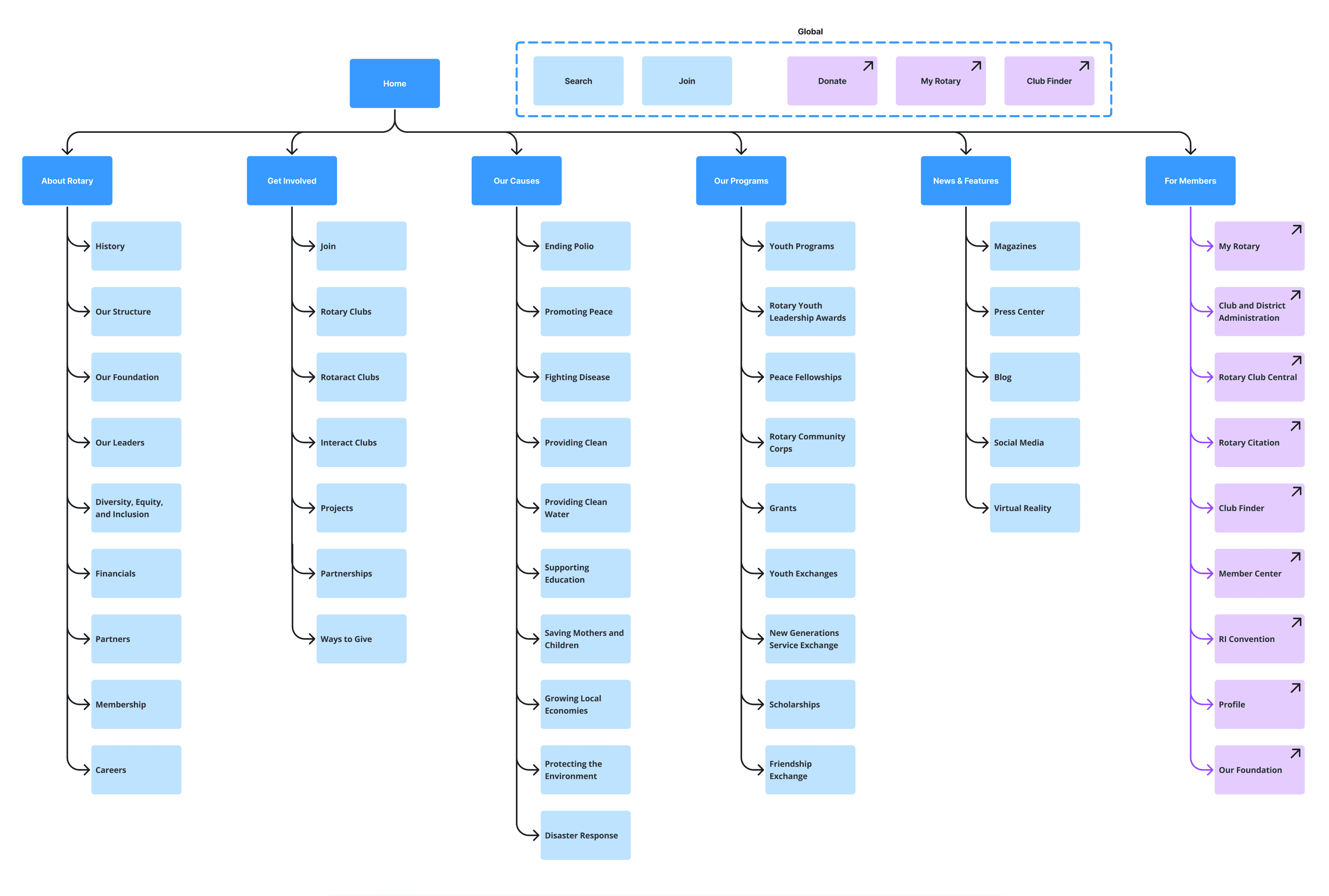
Viget, and our team, conducted card sorting, tree testing, and user testing to come up with a much improved site architecture. This reorganized brand offerings, and its supporting content, into intuitive and useful categories.
04. Deliver
Final Designs & collaborative development
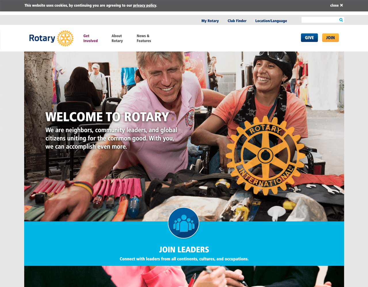
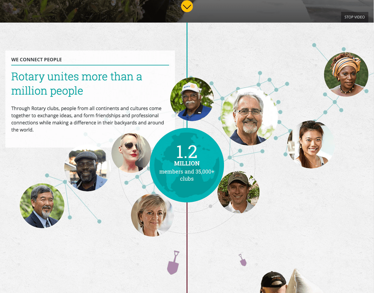
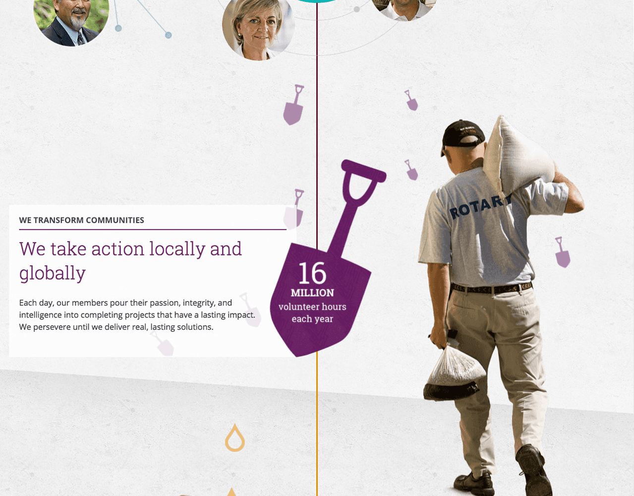
My design ideations focused on creating engaging elements, such as using an ambient video for the hero. Then using scroll trigged micro-interactions to bring the brand story to life. Ideally this would incentivize users to slow their page scroll and take in the content. Bringing this to life was only made possible by close collaborative development with Viget's lead frontend developer.
Scroll animation in action
The redesigned homepage was live for just about five years, winning a People's Choice Webby Award along the way. Check out the video to view the full page, scroll animation, and other interactions.
Results
There were immediate and positive results that we observed post-launch. Our success metrics showed a six percent lower bounce rate, site traffic was up by three million visitors, and median page load times were under three seconds. Some other, unexpected results I observed were a doubling of traffic to the donate page and a 15% increase in donations made.
reduced Bounce Rate
Site visitors
Avg. Page Load Time
Takeaways
The homepage redesign was a key part of a larger effort to better tell Rotary's story in the digital space. It successfully demonstrated the power of a story-driven approach. After five years of serving as the public face of Rotary's digital presence, our objectives shifted. The updated homepage moved from focusing on evergreen themes to showcasing more current and impactful news and feature articles. Being part of the project team, I was pleased to see the editorial team's work being highlighted.
