My deliverables
UX Research
UI Design
Usability Testing
Information Architecture
Interaction Design
My Role
UX Designer
Background
Rotary International is a global service organization, with membership exceeding 1.4 million individuals. These members are actively engaged in a wide range of humanitarian, philanthropic, and educational initiatives across the globe. The majority of these activities are financially supported through Global Grants, which the members apply for via the Rotary Grants Management System (GMS).
The annual omnibus membership survey, sent to members across the globe in seven languages, included quantitative and qualitative questions about the GMS. Of those responding, 2757 members had experience with the GMS and 1473 of them were active users. Respondents who identified as being dissatisfied with their GMS experience were give the opportunity to describe why. Analyzing the data revealed three primary categories of feedback: customer satisfaction, required staff intervention, and abandoned grant or giving up altogether.
Dissatisfied
Required Staff
Abandoned
n=1473
My Approach
01. Discover
Collect data, gain context, hear and empathize with what users are experiencing.
Stakeholder & SME Interviews
User Research
Analysis
02. Define
Synthesis of all research data into problems and solution hypothesis to be validated.
Research Insights
User personas
Success Metrics
03. Develop
Create and validate potential design solutions meet success criteria and objectives.
Wireframes & Prototypes
Stakeholder Validation
User Research Design
04. Deliver
Validate and refine with users until we arrive at build candidates.
User testing prototypes
Iterate & Refine
Dev Handover
01. Discover
The Current experience
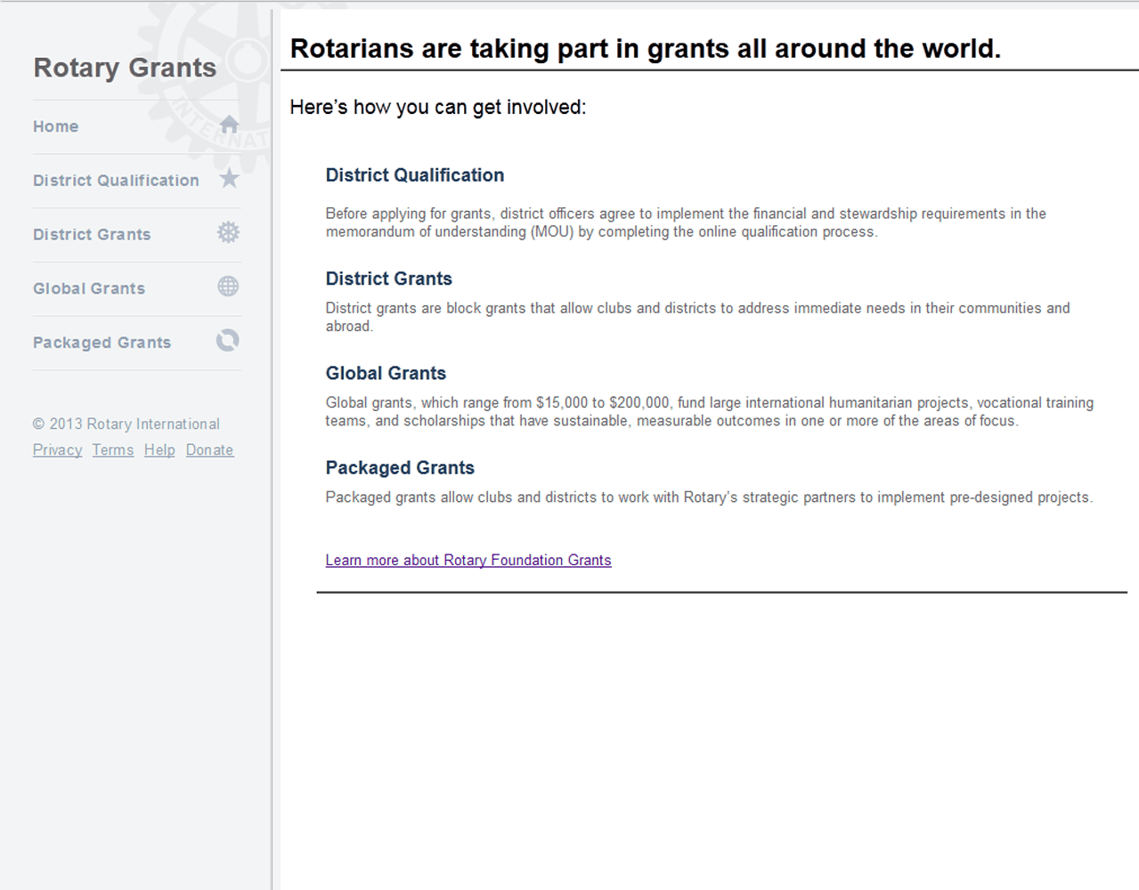
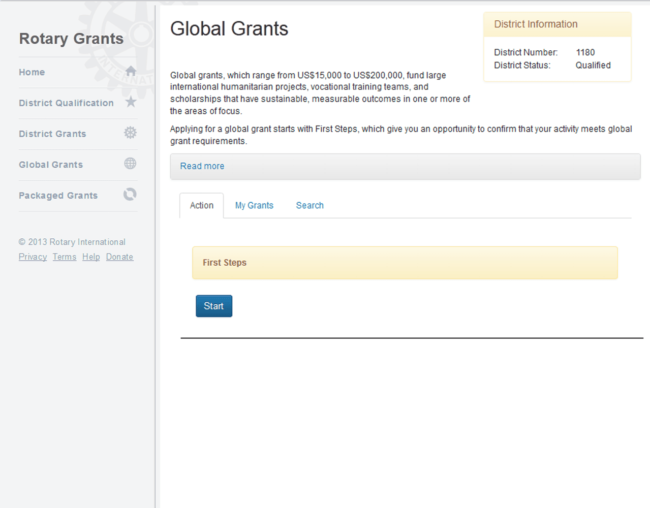
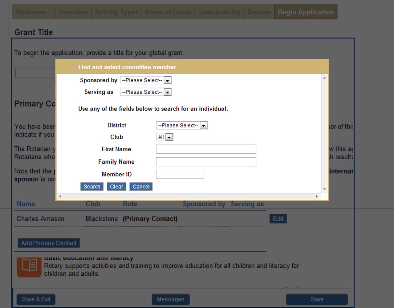
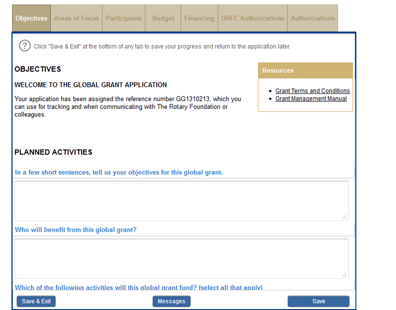
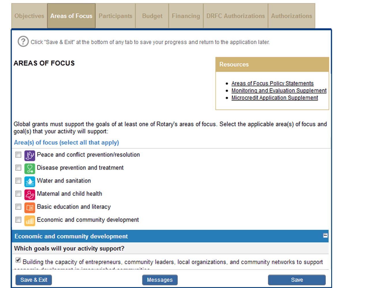
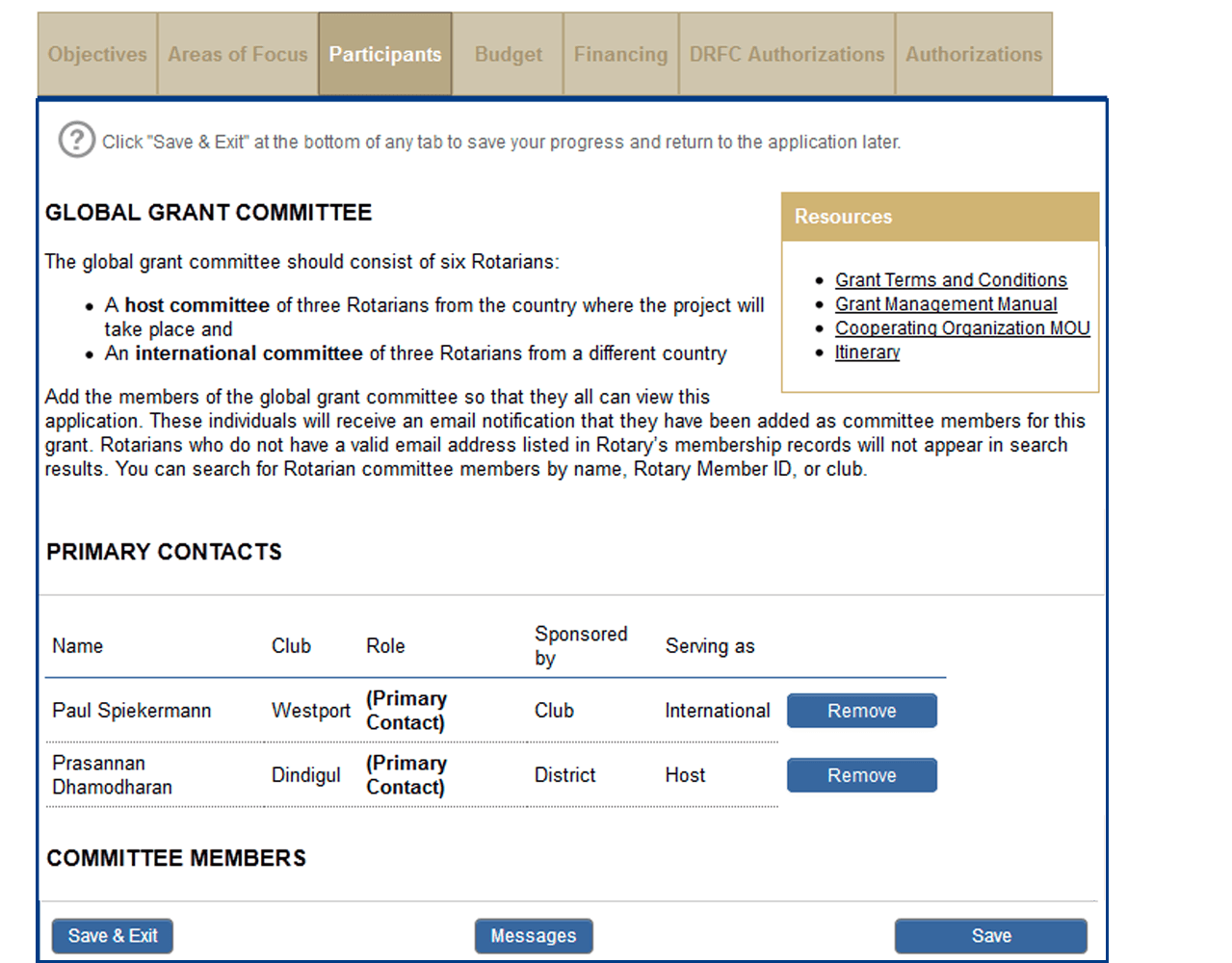
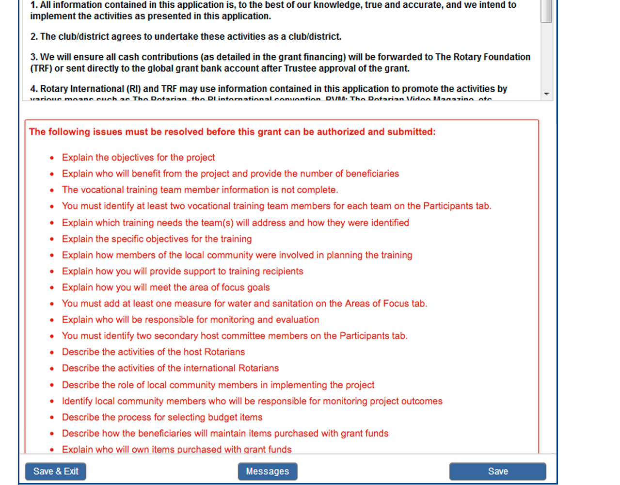
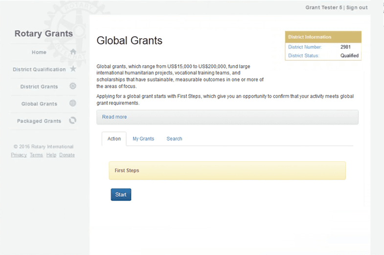
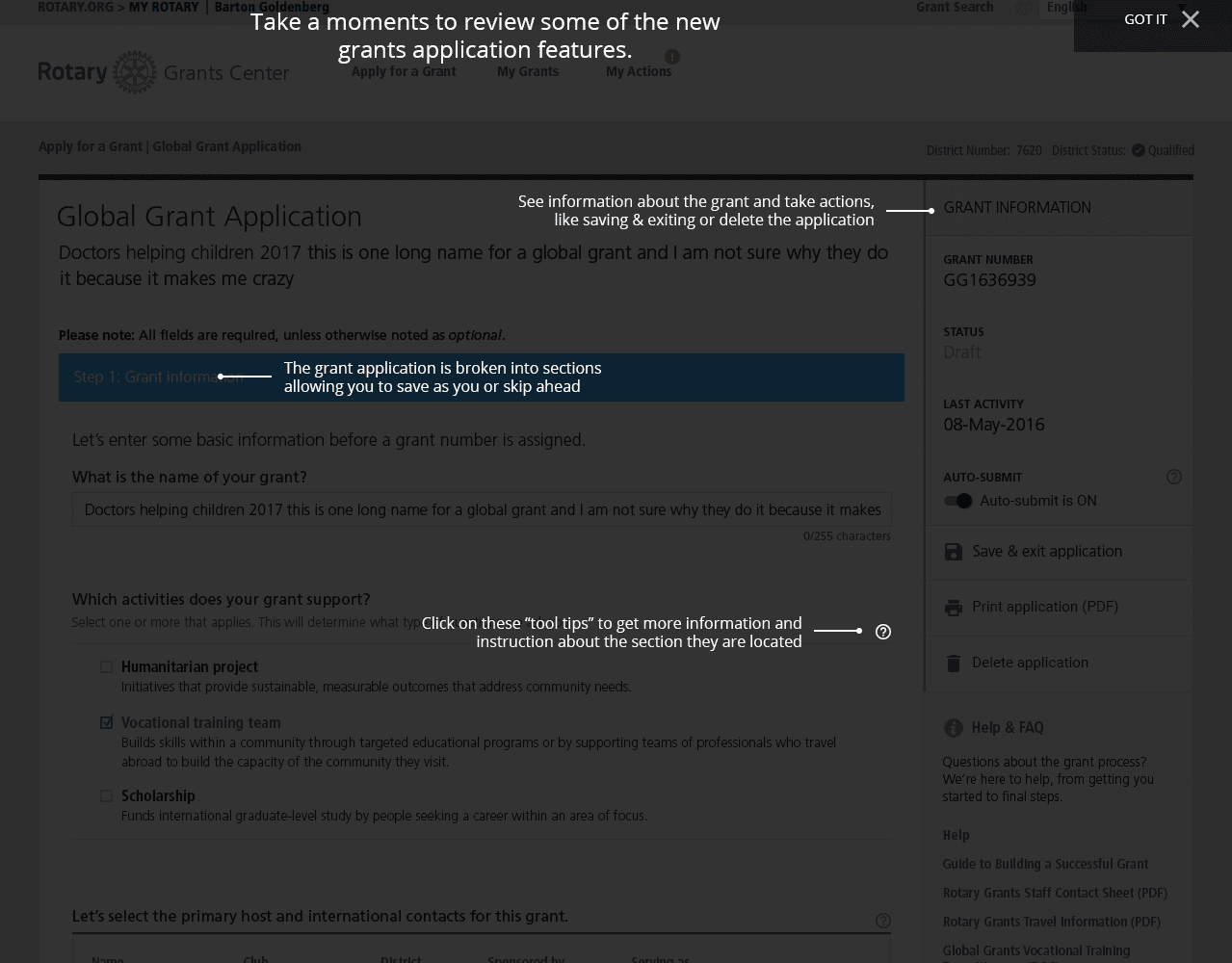
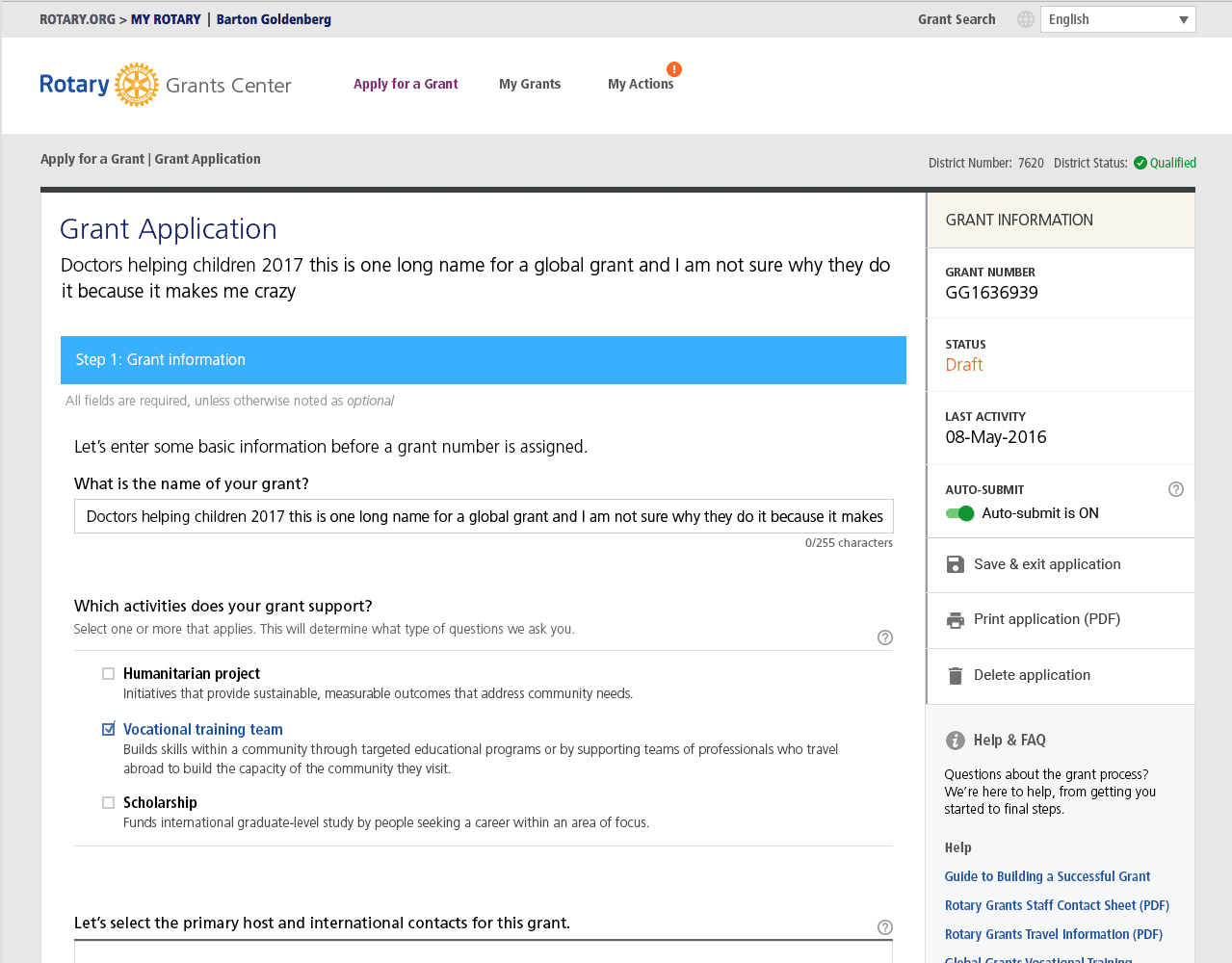
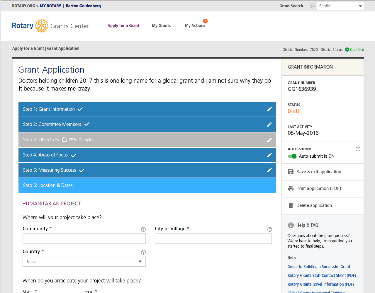
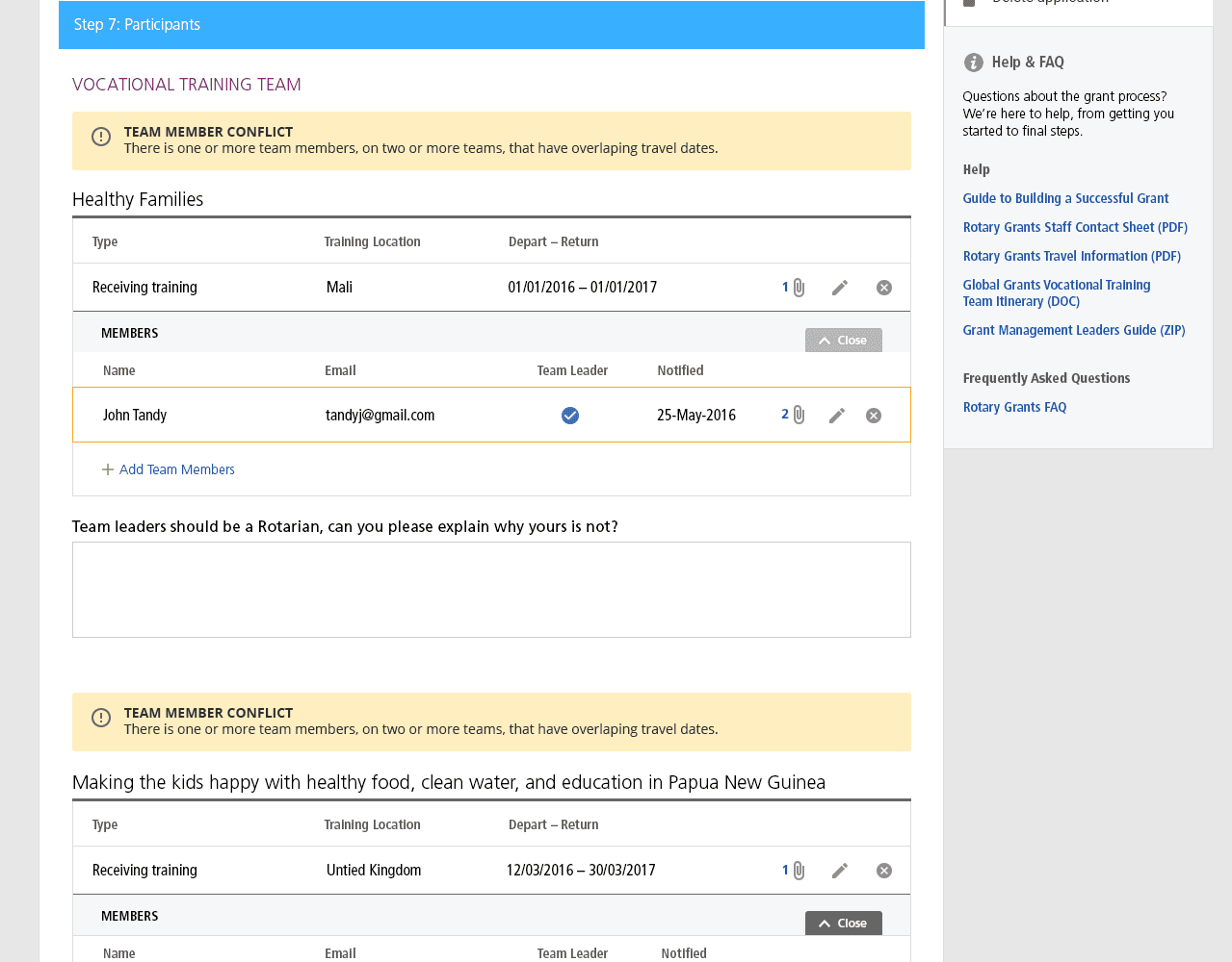
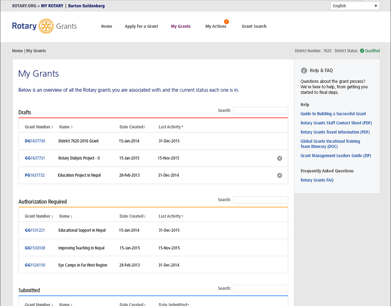
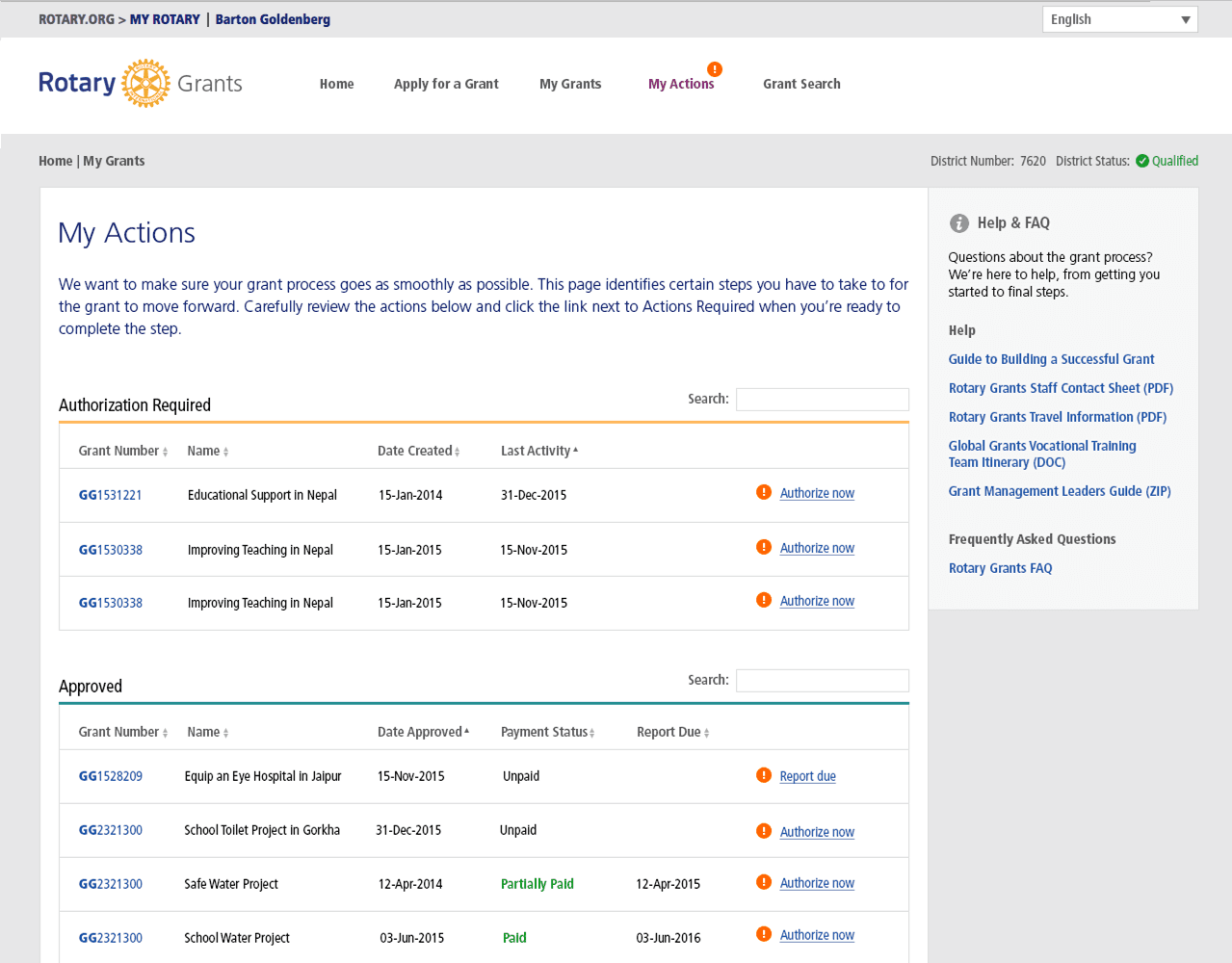
The current GMS was build on a very customized version of Smart Simple, a SAAS GMS platform. While the backend admin worked well for staff, the frontend was painful slow and frustrating for users. The interface provided little visual hierarchy to help user scan for primary paths and buttons. Also, there was no contextual error messages, rather only when a user submitted the whole application did the system conduct a global validation. This resulted in users being confronted with a long list of errors in red text which users nicknamed the "wall of red". This was a universal pain-point.
Hearing the pain
We conducted usability testing and user interviews with several users. Collecting both quantitative and qualitative data such as time on task, error rate, and user sentiment were collected.
Tools used: Usertesting.com, Excel, Qualtrics
02. Define
Our users
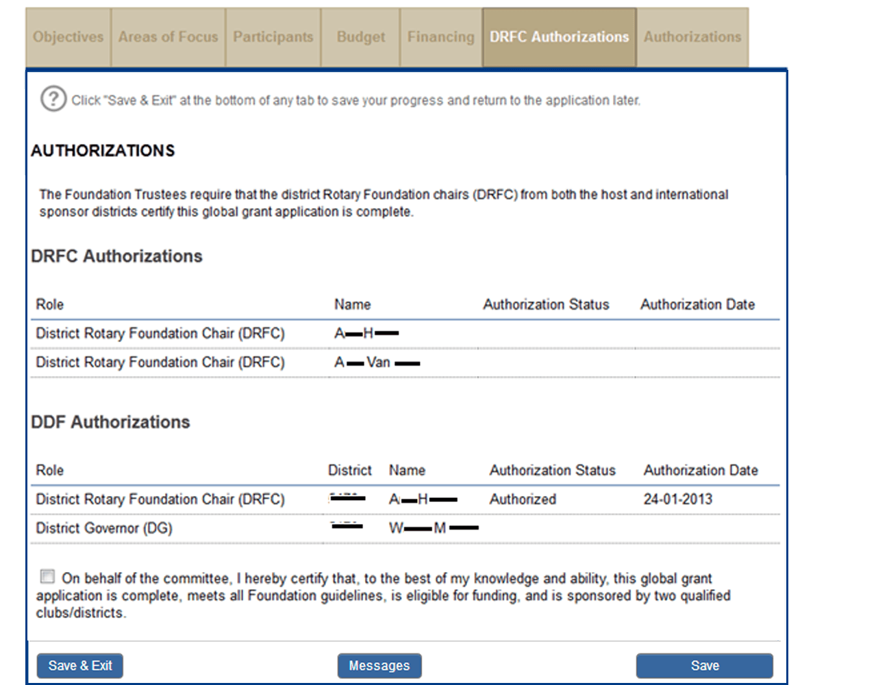
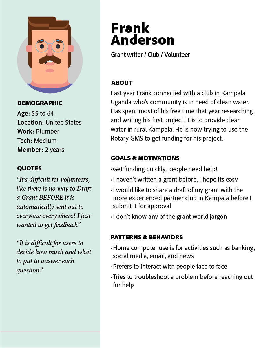
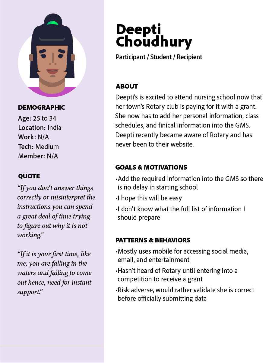
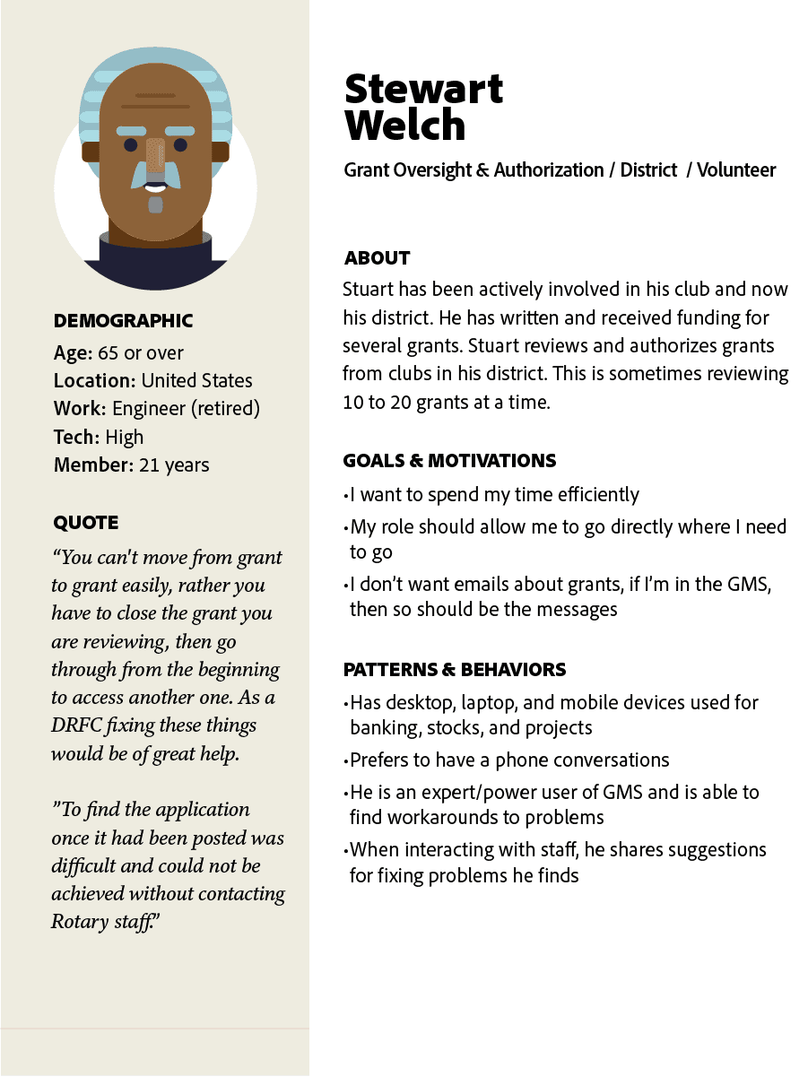
Personas put a face to and describe what the motivations were for our primary users. I created them based on the three primary user groups with specific roles and access levels. These were Grant Writer, Participant, and Grant Oversight & Authorization.
Defining success
Research synthesis validated themes we first identified in survey data as ideal success metrics. We used those three metrics to hypothesize solution approaches around. Click a card to flip and see my solutioning approach.
03. Develop
Developing Solutions
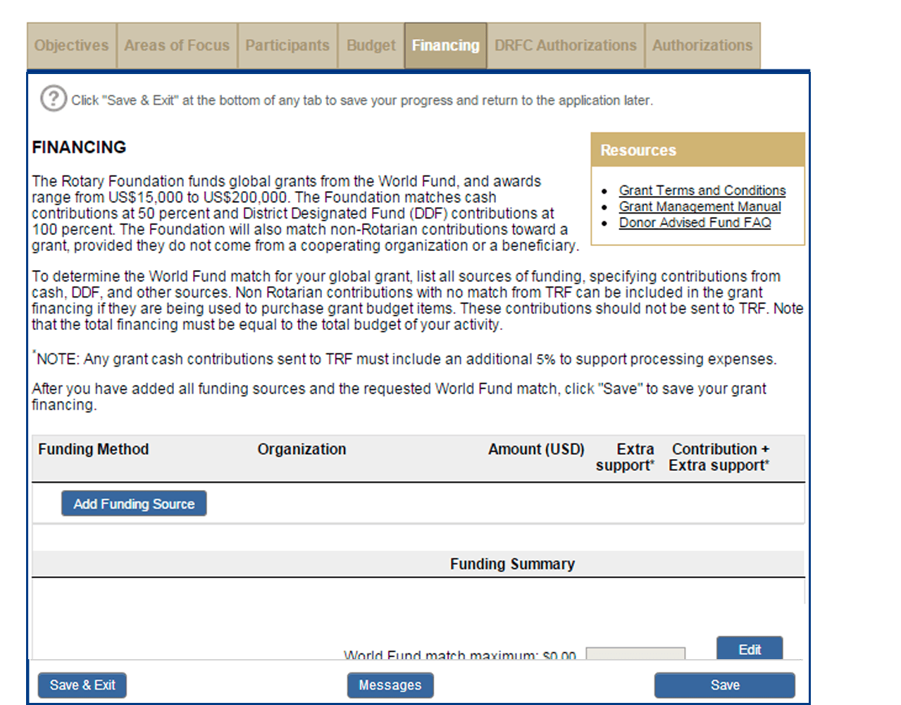
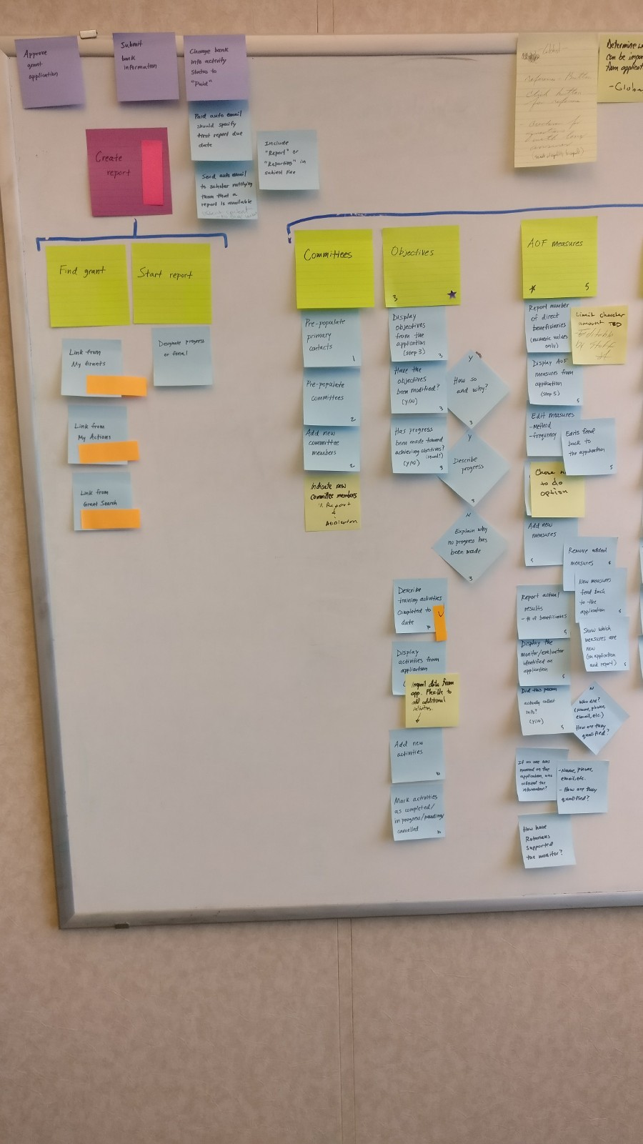
We created a user-story map board in order to visualize the activities, steps, and details of workflows. This method also made it easy move the board into Agile epics, user stories, and acceptance criteria. This also provided a way for us gain a shared understanding of workflows that could then be validated with stakeholders.
A Note on Process
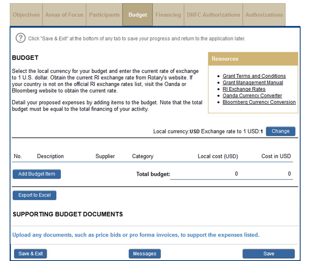
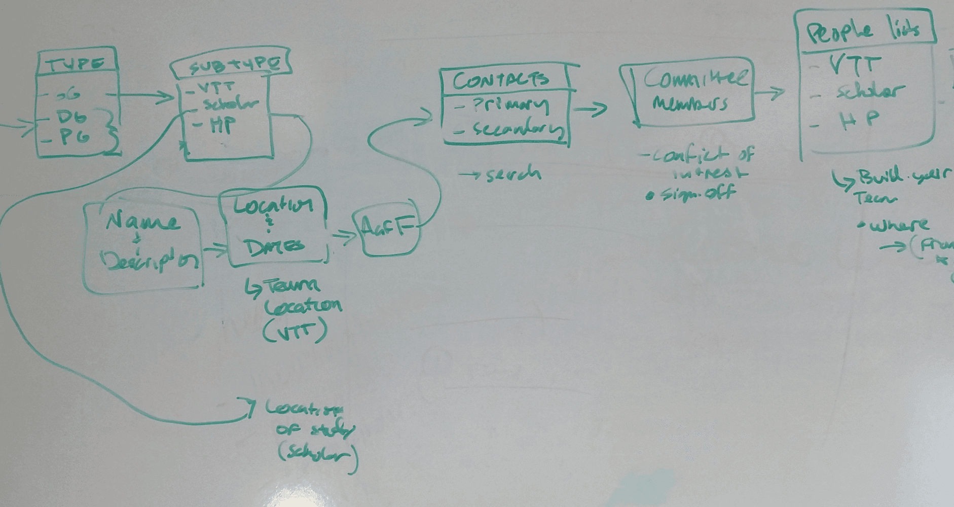
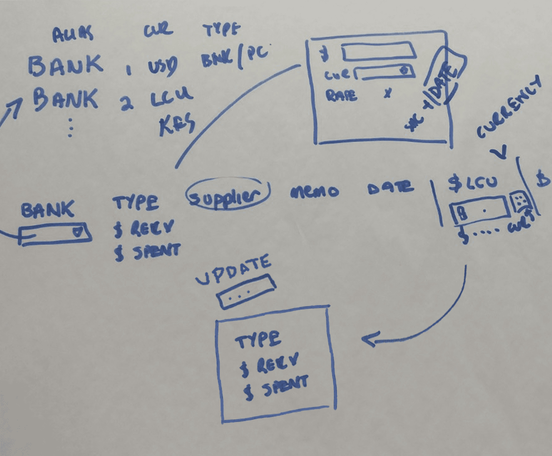
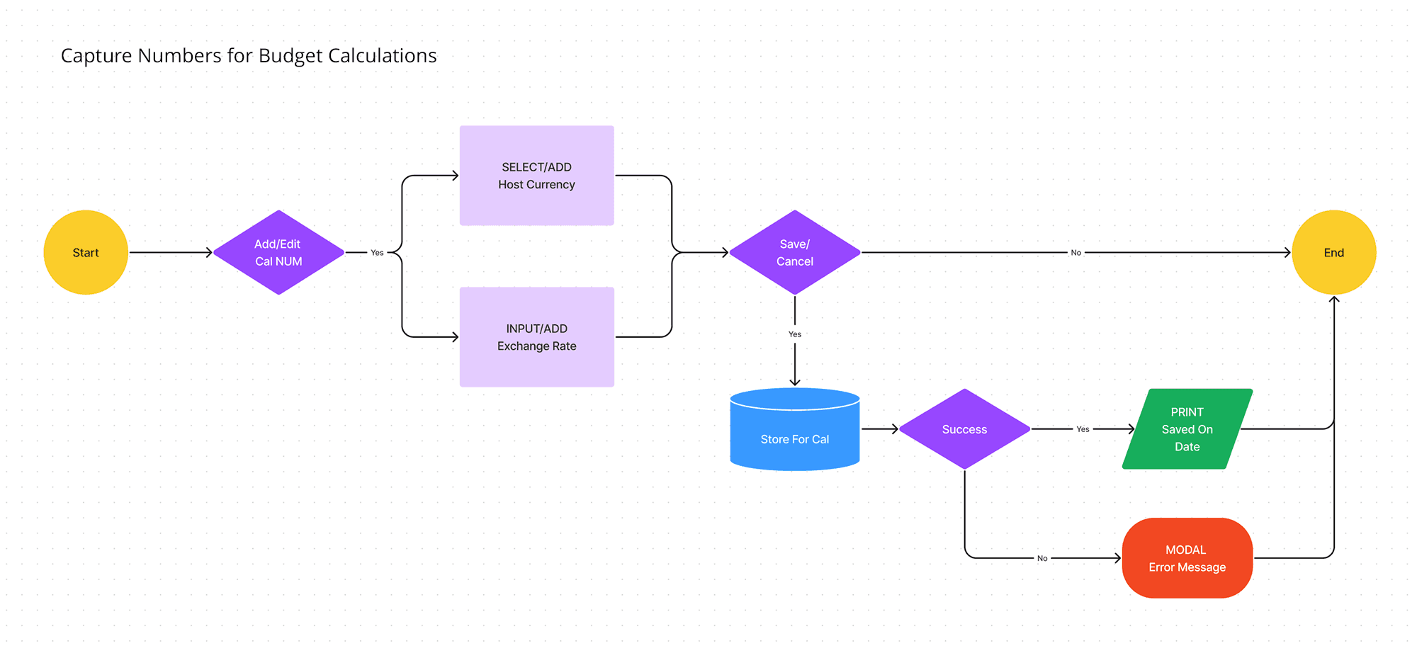
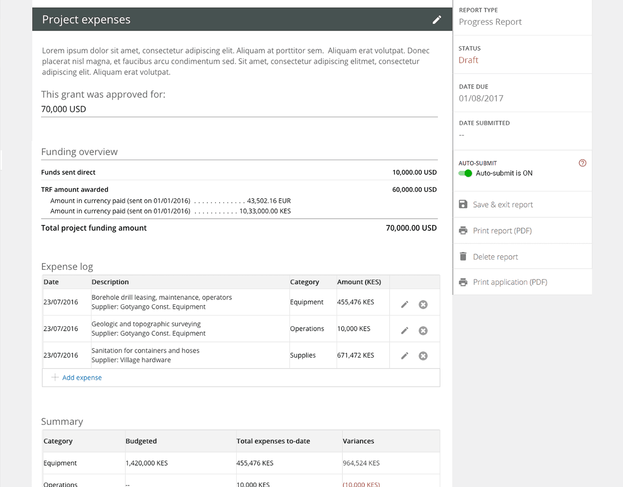
Translating complex business rules into intuitive interfaces requires understanding the dependancies. In this case, I had to account for capturing an exchange rate for multiple currencies so that budget items that sums in USD would be accurate. We collaborated with SMEs and a whiteboard to visualize and validate some of the complexity. I used that as a starting place for mockups and prototypes.
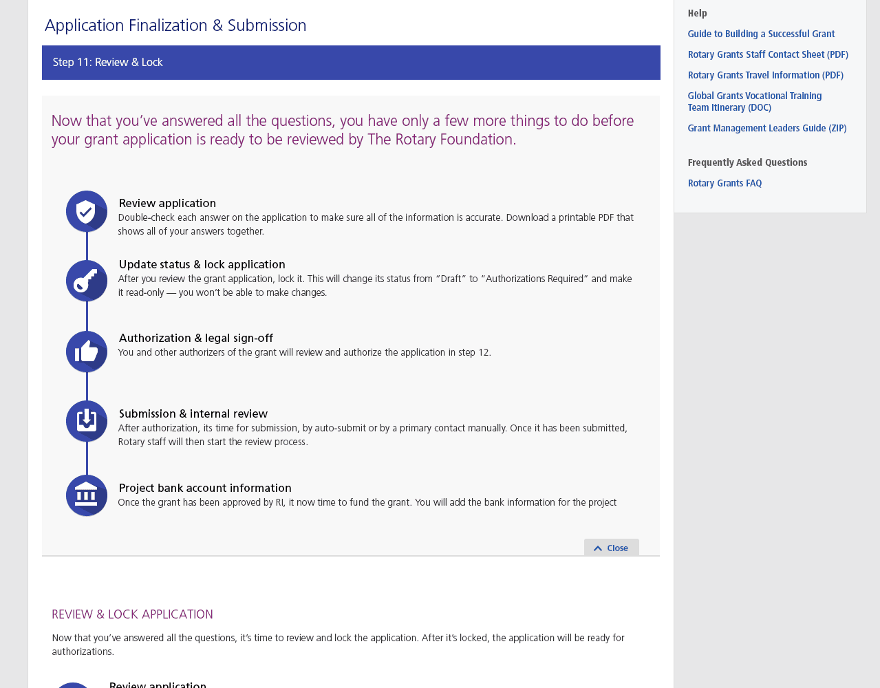
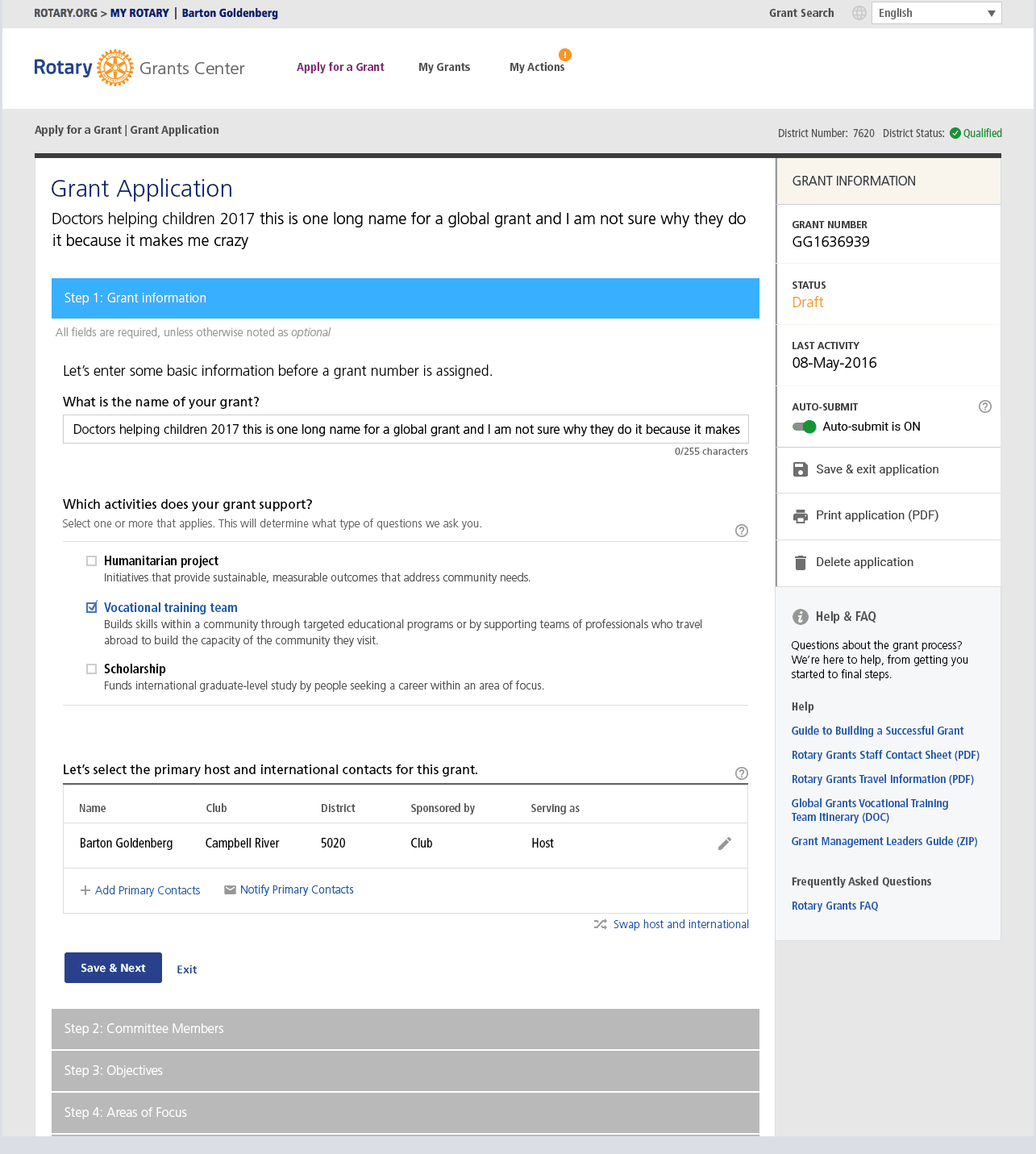
How can we guide users, who might skip the instructions, to provide the necessary data to proceed? I opted for a progressive disclosure pattern. Initially, the page prompts the user to enter the project's local currency and the expected exchange rate in USD (since USD calculations are needed). Once this information is provided, the budget section is revealed and becomes functional.
04. Deliver
Validating with our USers
We conducted moderated and unmoderated user testing using UserTesting.com. For our users in Europe and Asia, the unmoderated sessions were ideal. However, moderated sessions provided me the opportunity to ask post-test follow-up questions. This validating with users was essential to how we refined our design solutions. Putting designs in front of users is always a high-value and rewarding activity.
Listening to Users
We tested our design solutions with users and made refinements based on insights and success metics criteria. The feedback and data was extremely positive.
Tools used: Usertesting.com
Results
The data we gathered during the project, post-launch metrics, and themes from staff showed large improvements to our baseline performance metrics. Improvements to the SaaS platform, and how database calls were being made, vastly improved system response times. We also saw a 25% decrease in staff interventions — a decrease I believe will continue as users become more confident in the new GMS. Overall, stakeholders and management were very pleased with the outcome.
Dissatisfied
Required Staff
Abandoned
n≈104
"The best grant application I have ever seen... I'm super impressed… I can't say it enough times."

Grant Writer,
Club Member
Takeaways
A few months post-launch, the team was tasked with planning a phase two to rollout improvements the other GMS verticals. This would include the Global Grant Reporting, District Grant (including reporting), and VTT workflows.
In the future, I think that a tool like Miro would making building a user-story journey map easier to manage and be remotely accessible.
