My deliverables
Responsive Design
UX Research
UI Design
Information Architecture
Interaction Design
My Role
UX Designer
Background
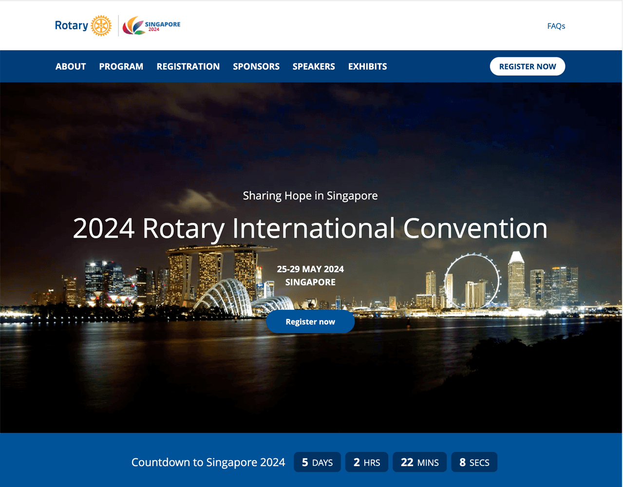
Rotary’s International Convention is a six-day event that takes place in a different country every year. It attracts people from all continents and cultures to share, learn, and bring positive change to communities worldwide. The convention website is the central hub for buying tickets, registering for events, viewing schedules, learning about host city happenings and more. It also provides a home for news and articles while the event is live.
The current convention website was built on Drupal, our legacy CMS, and needed to be migrated to our new CMS platform. This planned migration gave us the opportunity to align the visual design with our web properties, simplify the information architecture, and, provide conversion path options. Site metics pointed to a large amount of page-bounces across multiple pages, indicating users were not finding what they were looking for. Supporting this was a theme from call-center staff that users were having trouble with finding content.
My Approach
01. Discover
Collect data, gain context, hear and empathize with what users are experiencing.
Stakeholder & SME Interviews
User Research
Analysis
02. Define
Synthesis of all research data into problems and solution hypothesis to be validated.
Research Insights
User personas
Success Metrics
03. Develop
Create and validate potential design solutions meet success criteria and objectives.
Wireframes & Prototypes
Stakeholder Validation
User Research Design
04. Deliver
Validate and refine with users until we arrive at build candidates.
User testing prototypes
Iterate & Refine
Dev Handover
01. Discover
The Current experience
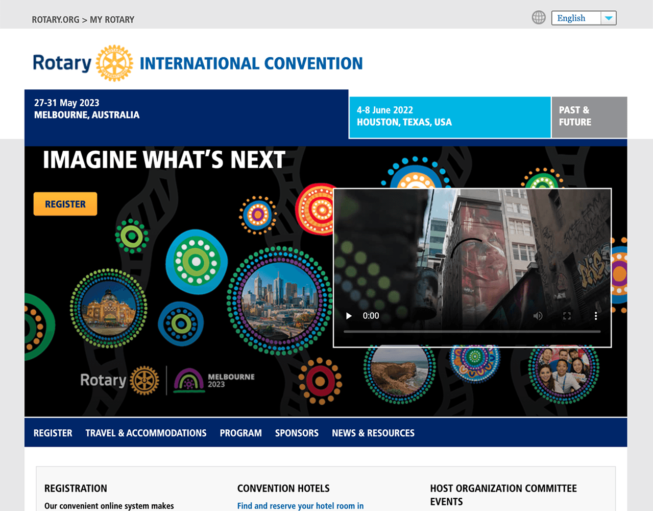
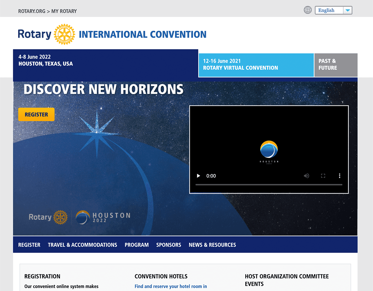
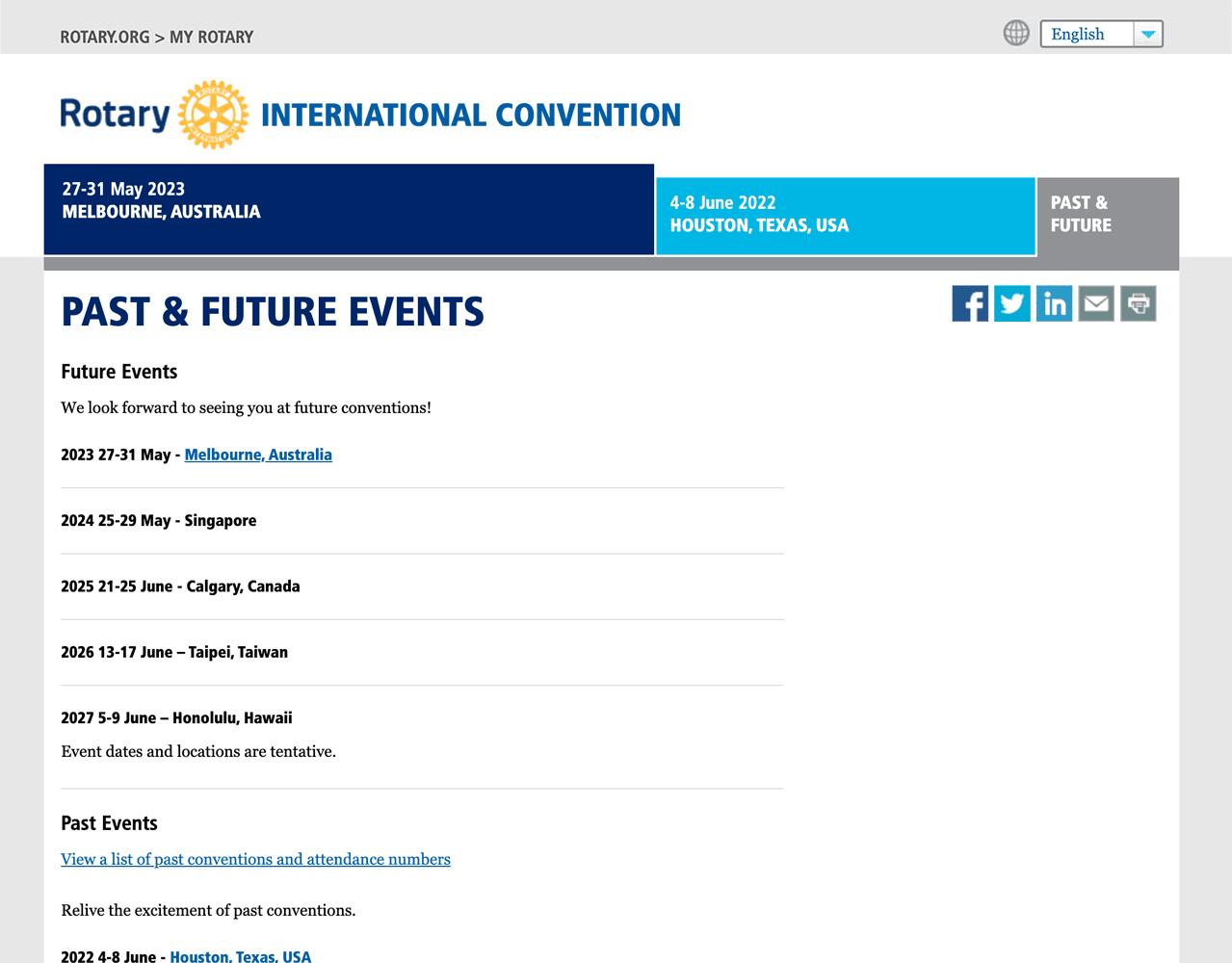
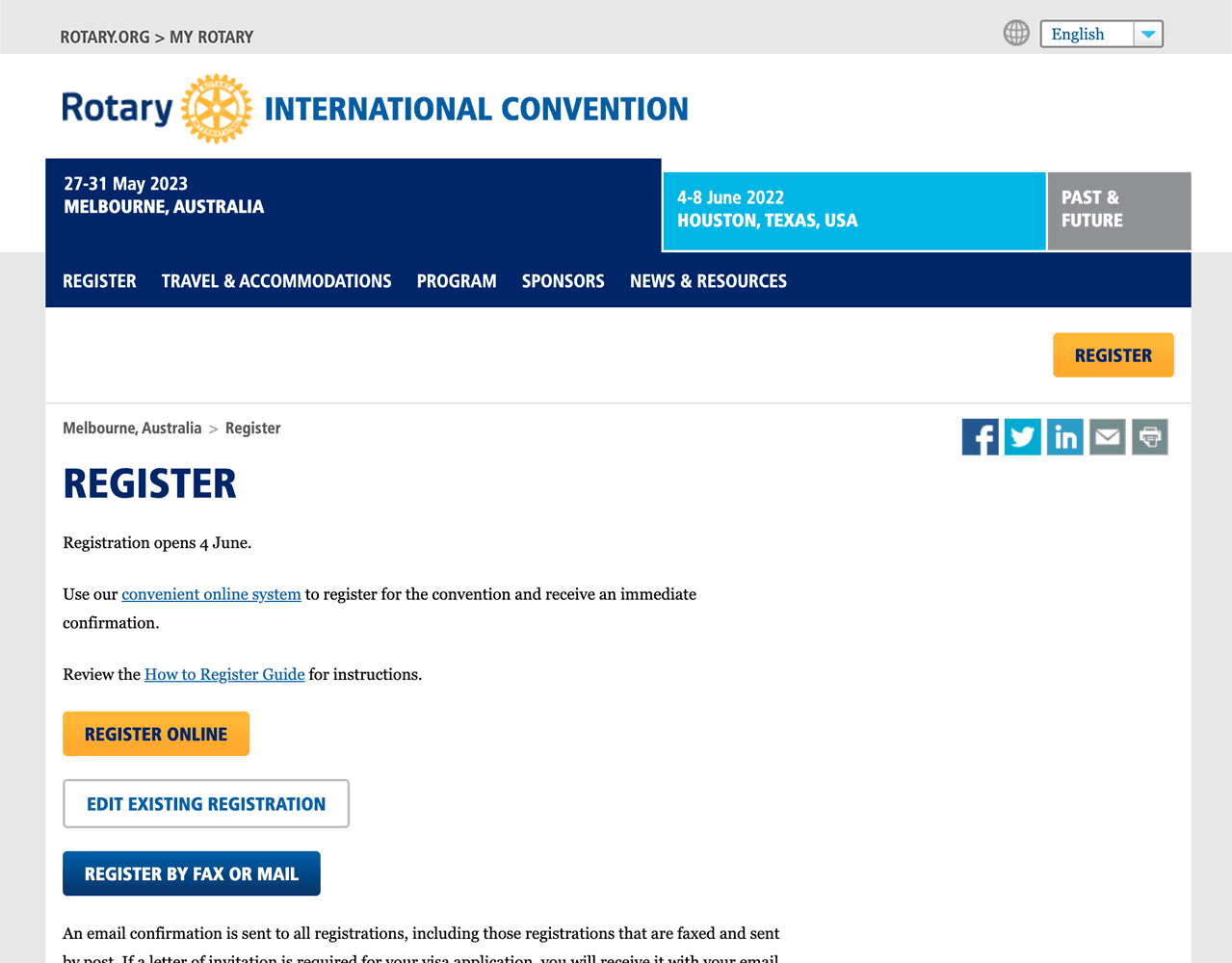
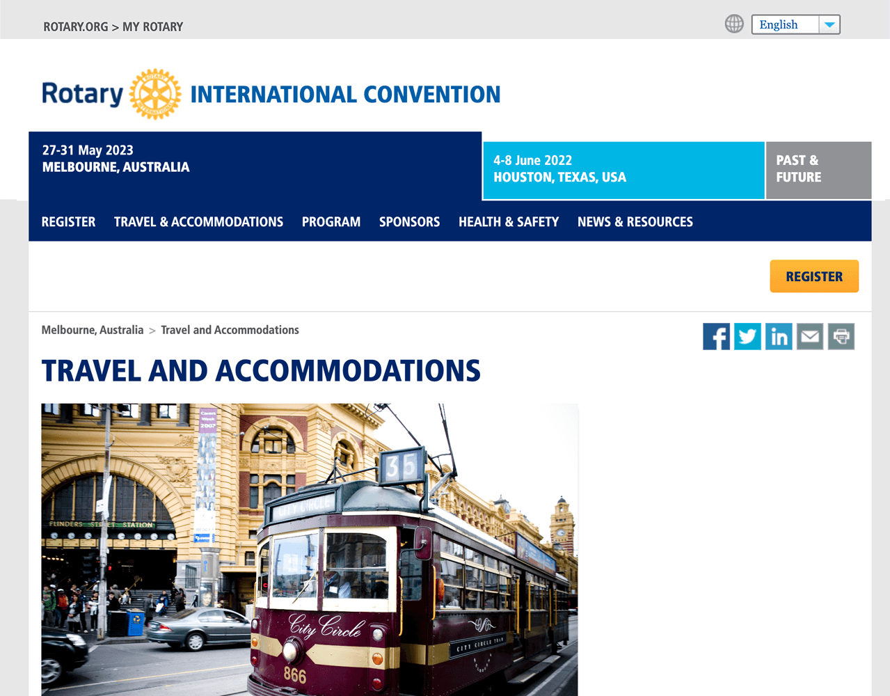
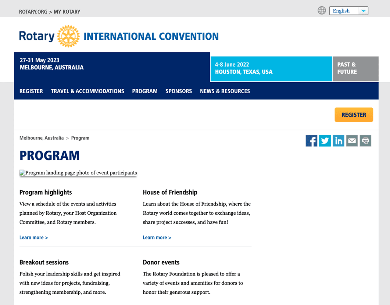
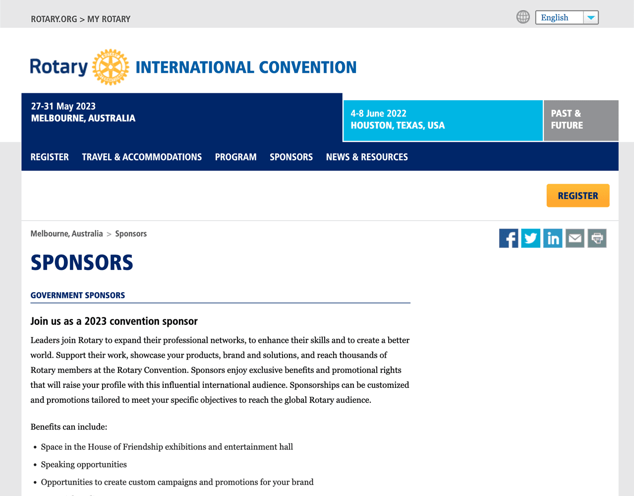
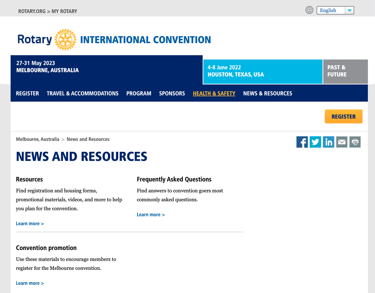
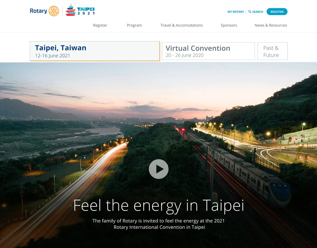
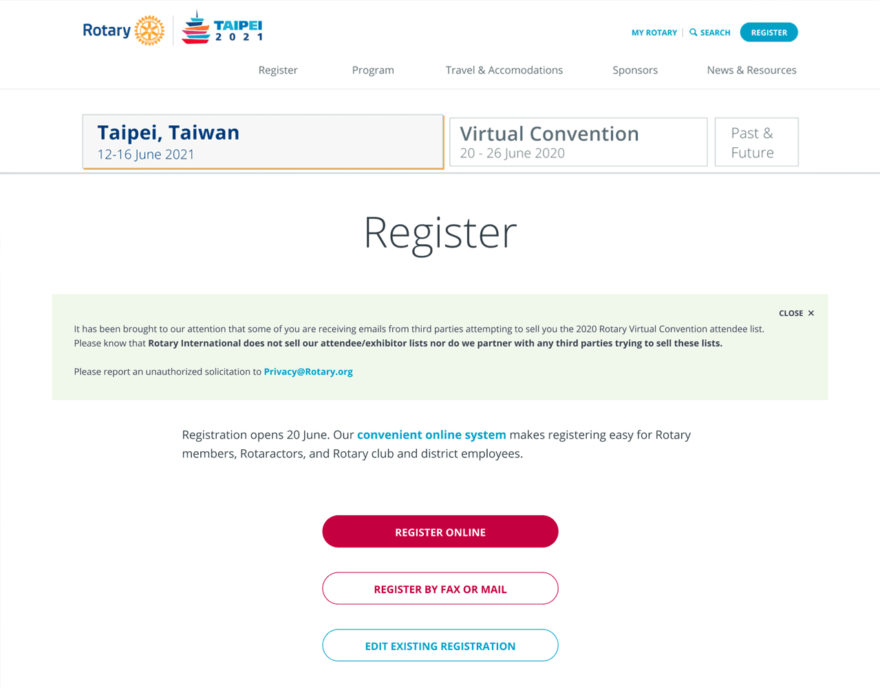
Site navigation was confusing with two separate navigational systems. In the primary position were three tabs for "current", "next", and "future & past" conventions. The navigation for website itself was positioned under the hero heading section. Interior pages lacked a dynamic structure and layout, they were mostly a long list of copy. This made it hard for users to quickly scan the page and find what they were looking for due to the inconsistent visual hierarchy.
02. Define
Convention users
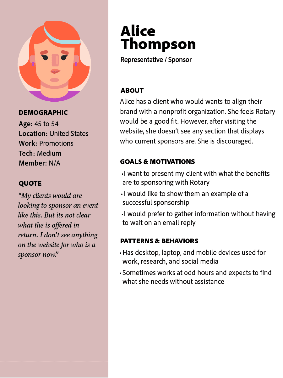
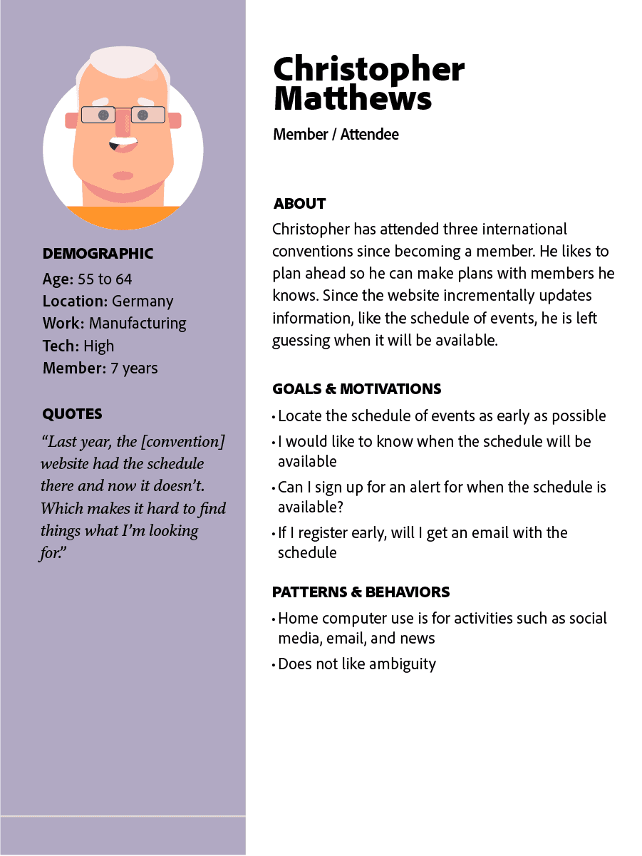
I created personas based on the two primary user groups identified in the project objectives. These were potential Attendees and Sponsors.
Defining success
There was two main objectives coming out of meetings with key stakeholders in development and our events teams. One is to make it easier for users to find what they are looking for, including potential sponsors. The second being to simplify the multi-site navigation issue. To measure if we accomplished these objectives, I decided that lower bounce rates and lower click depths. These metics should allow us to measure the effectiveness of the new site structure and navigational system is helping users accomplish their primary tasks.
03. Develop
Developing Solutions
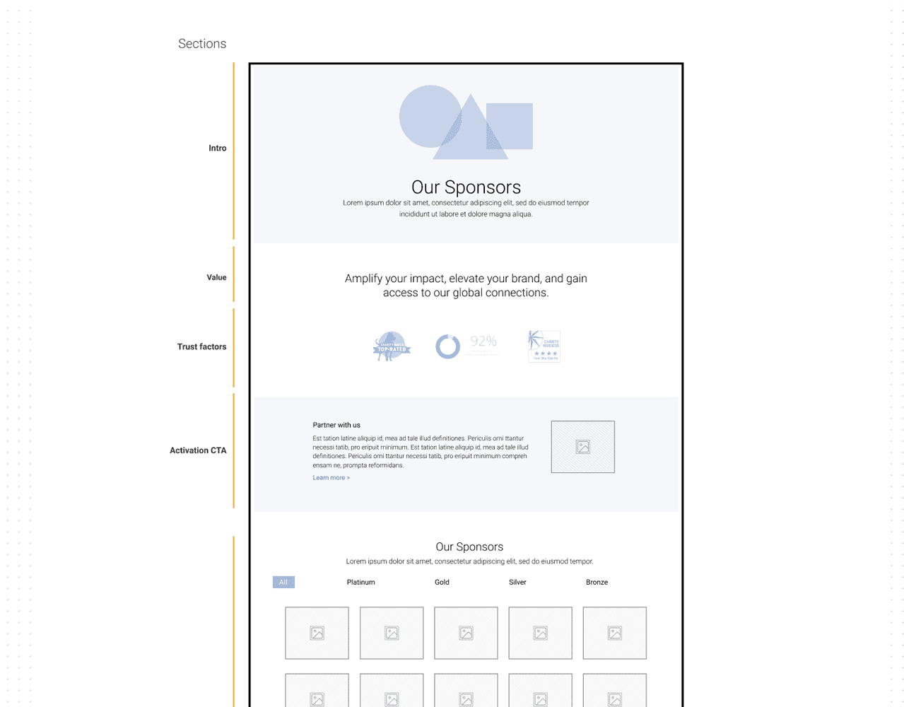
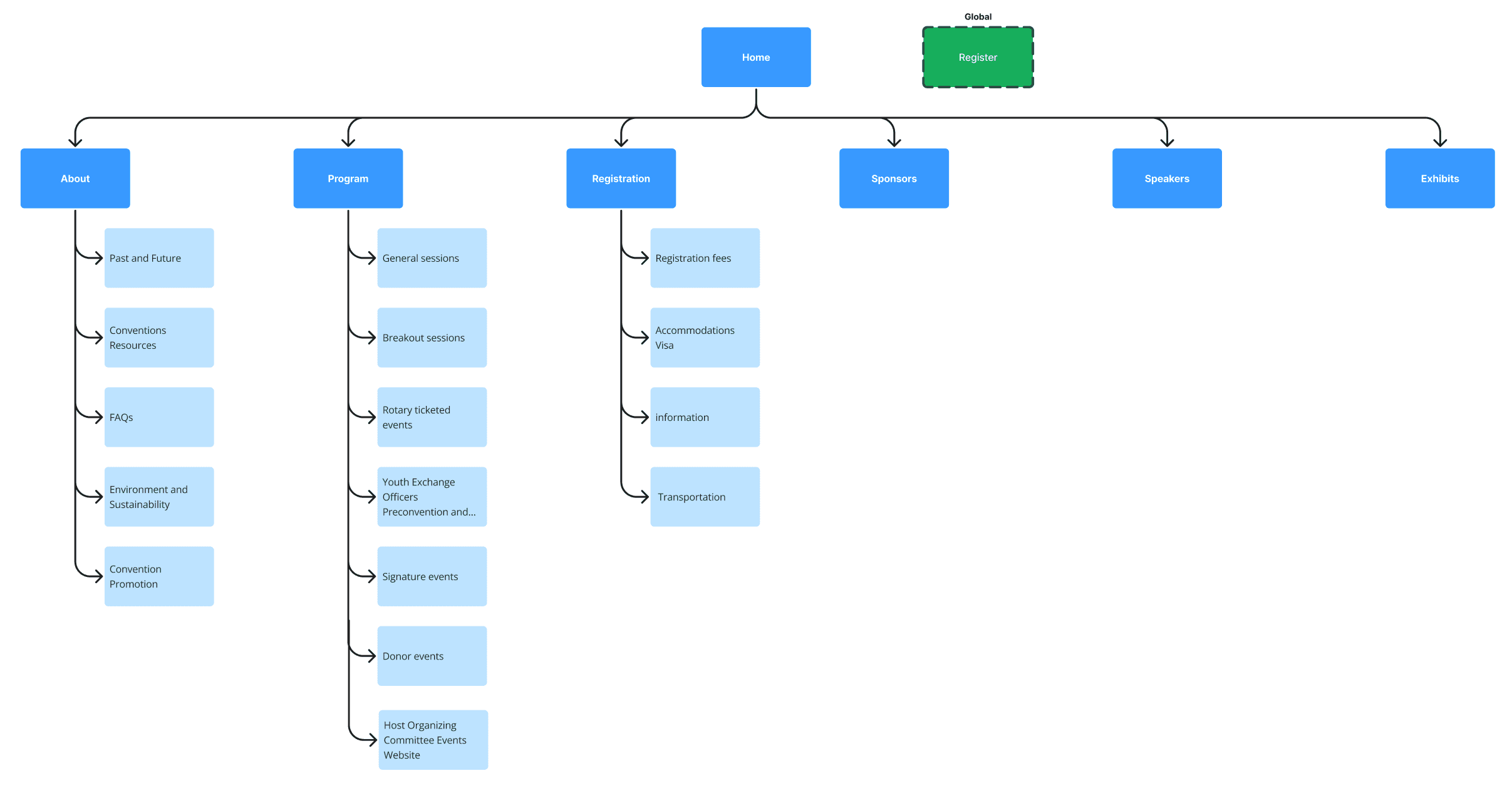
I created a new information architecture, site map, and page structures that would help the primary audiences to accomplish their goals. There were some previous design explorations that had been done. Those designs, however, retained the confusing navigation and the flat interior page structure. I met with stakeholders to identify what elements from that could be leveraged in the new designs. This helped accelerate my design process and gain an better understanding of our stakeholder's expectations.
A Note on Process
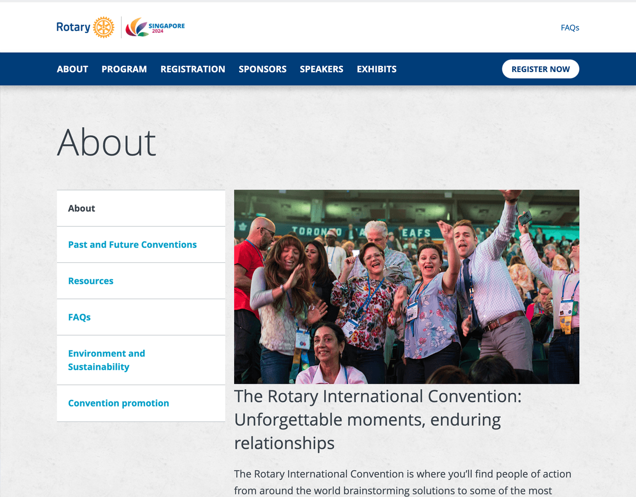
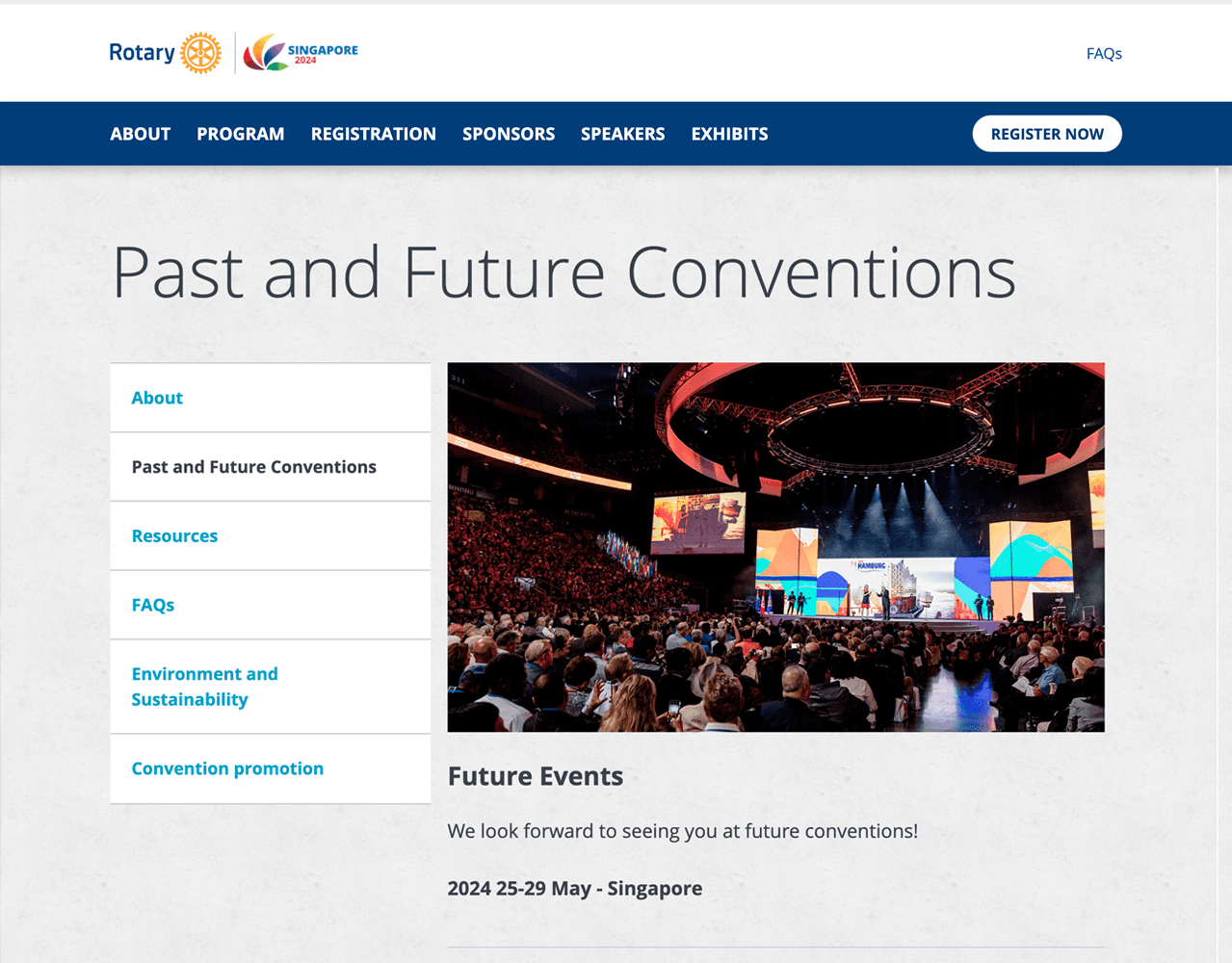
After brainstorming and card sorting exercises with stakeholders, we settled on a new site architecture, and navigation, that focused on eliminating the separate verticals for future and past events. It also elevated high traffic verticals and taxonomies with intuitive parent-child relationships. This new structure performed well with some limited tree testing. For example, the old structure placed the low traffic page, "Health & Safety", as a main navigational parent category. I moved it to a more appropriate location, as a child of "About", which was quickly found by users when tested.
04. Deliver
Handing off for release
I moved off the project after establishing the new site architecture, navigation, page structures, and visual design. The team, along with a consultant, moved forward to built the site that included a changes to accommodate new content.
Figma mockups can be viewed here (a selection)
Takeaways
While this project had many curveballs, like the scope changed in the middle of the project and the I moved off the project before development handoff. That said, the new convention website still solved many of the issues users experienced.
I think if I had a chance to revisit this project, I would make sure timelines included "UX QA" time in the development process. As a way to validate development is delivering as close to the designs stakeholders signed off on.
