UX design
UI design
B2C
B2B
Charles Jones Website redesign
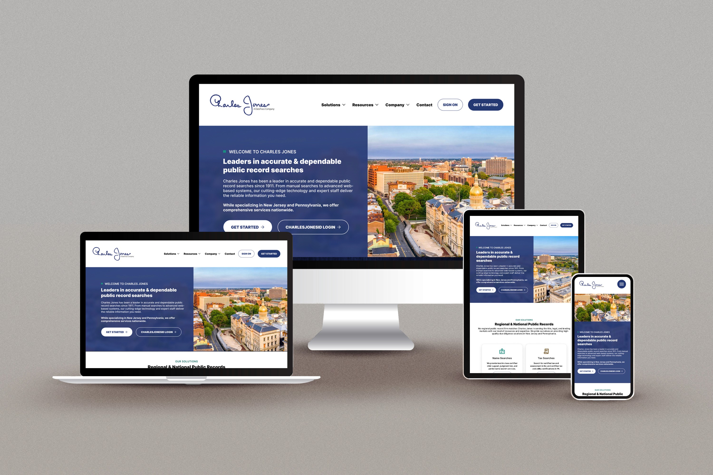
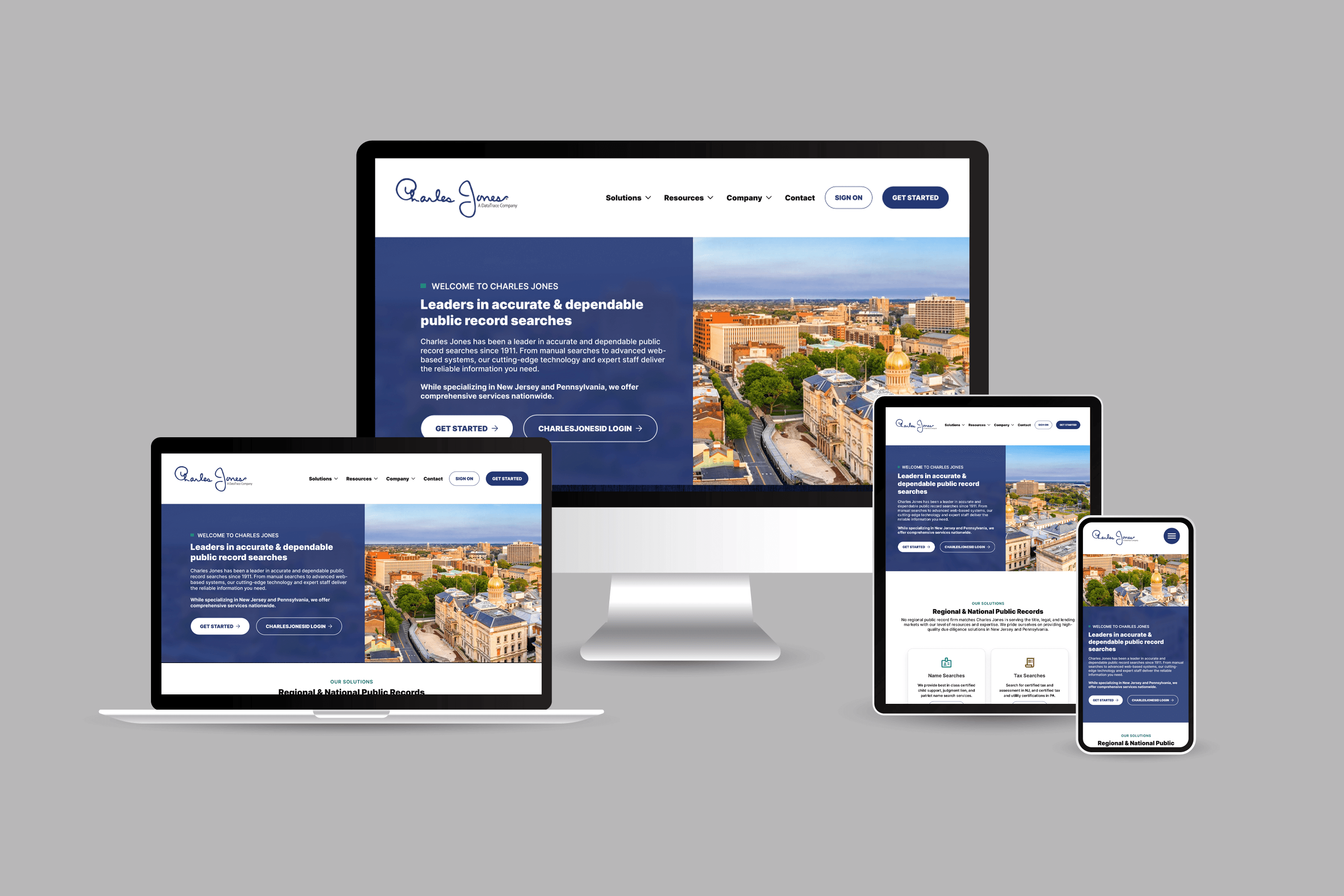
Responsive website redesign for a leader in accurate and dependable due diligence searches.
My deliverables
Accessibility Audit
Responsive Design
UI Design
UX Research
Design System
My Role
UX Design consultant
Overview
Background
Charles Jones has been a leader in accurate and dependable due diligence public record searches since 1911. From manual to advanced web-based searches, their cutting-edge technology and expert staff deliver the reliable and consistent results. Dedicated to excellence and innovation, Charles Jones continues to set the standard in the industry.
I was contracted to redesign charlesjones.com by WorkU as part of a larger marketing and social amplification effort. My work included creating a foundational report based on discovery findings that outlined issues, solutions, and strategies for the redesign and beyond.
Enhance User Experience:
Streamline navigation to ensure users can easily find information and services.
Improve the overall layout and design to create a more intuitive and user-friendly interface.
Modernize Design:
Update the visual design to reflect a modern and professional appearance.
Ensure the design is consistent with current web design trends and industry standards.
Reflect Brand Identity:
Align the website design with Charles Jones’s brand identity and values.
Ensure the website conveys a professional and trustworthy image to all users.
Improve Accessibility:
Ensure the website meets or exceeds accessibility standards (WCAG 2.1) to accommodate all users.
Process
Discover
Collect data, gain context, hear and empathize with what users are experiencing.
Stakeholder Interviews
Information Architecture Audit
Domain Research
Accessibility Audit
Define
Synthesis of all research data into problems and solution hypothesis to be validated.
Research Insights
Design System Draft
Accessibility Remediation Plan
Develop
Create and validate potential design solutions meet success criteria and objectives.
Wireframes & Prototypes
Stakeholder Validation
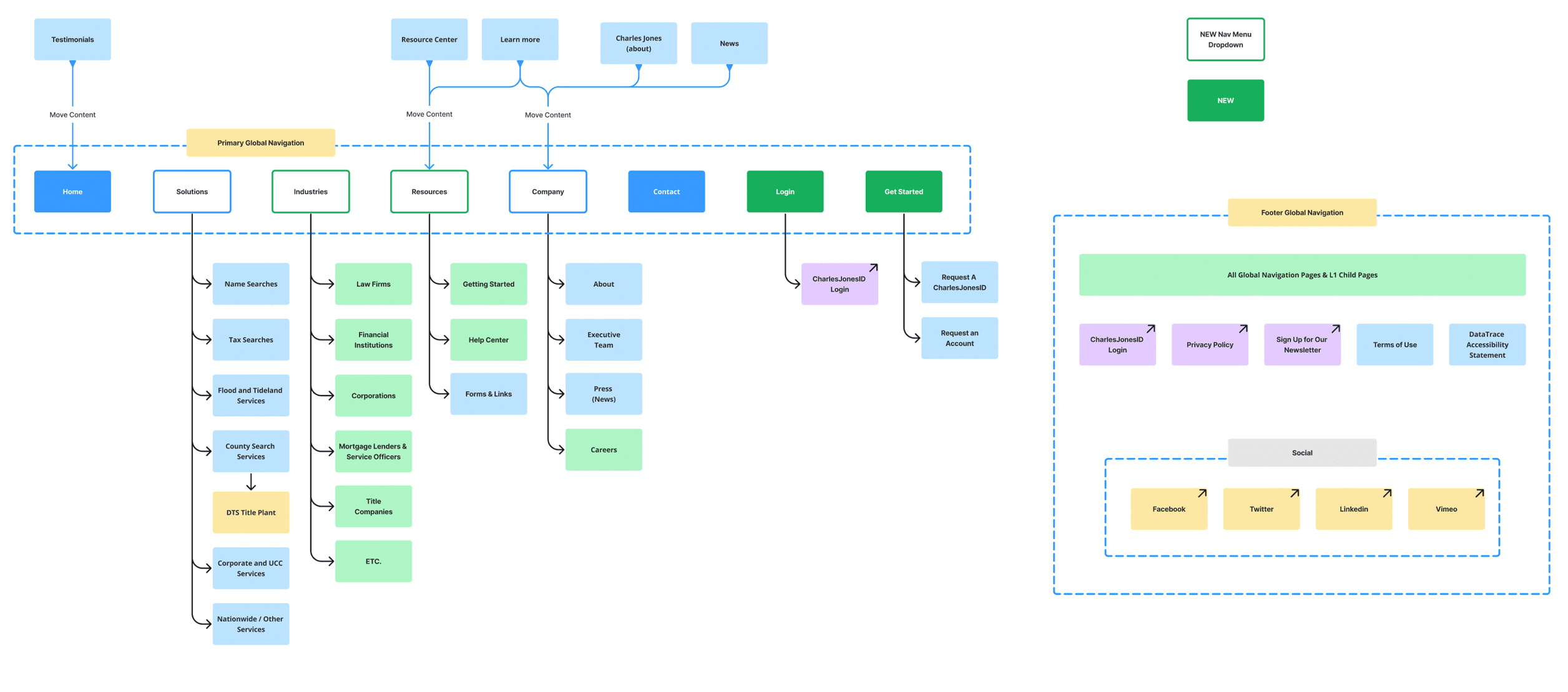
New Site Structure & Navigation
Deliver
Validate and refine with users until we arrive at build candidates.
Responsive Mockups
Design Sytem
Iterate & Refine
Dev Handover
Discover
I started off the discovery phase with conducting an audit of the website's information architecture and design. I also did domain specific research to build an understanding of what the standard offerings, messaging, structure, and branding of competitors. Then I created a stakeholder survey to gather insights into pain-points that needed to be resolved, brand identity, and gain a deeper understanding of their offerings and processes. Lastly, I conducted an accessibility audit to make sure any issues found are fixed in the redesign - like embedding text into images without alt or aria tag descriptions.
IA & Design Audit
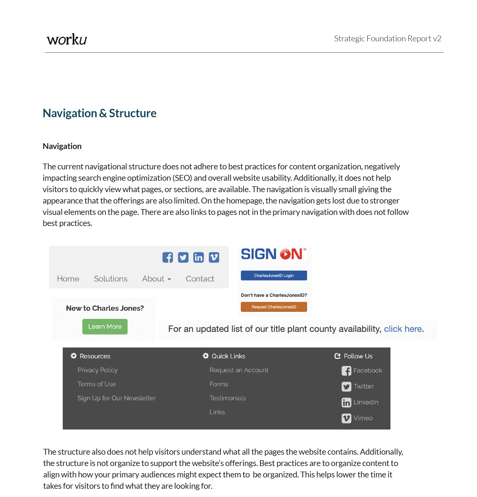
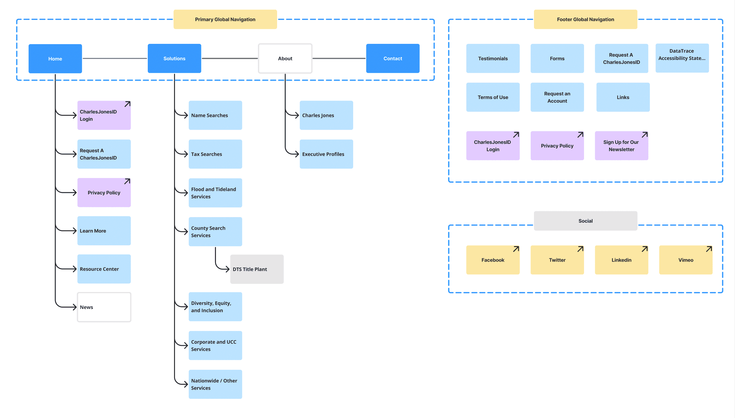
I conducted an information architecture and design audit along with solution recommendations. These recommendations were prioritized to be addressed in the redesign project.
Stakeholder Interview SUrvey
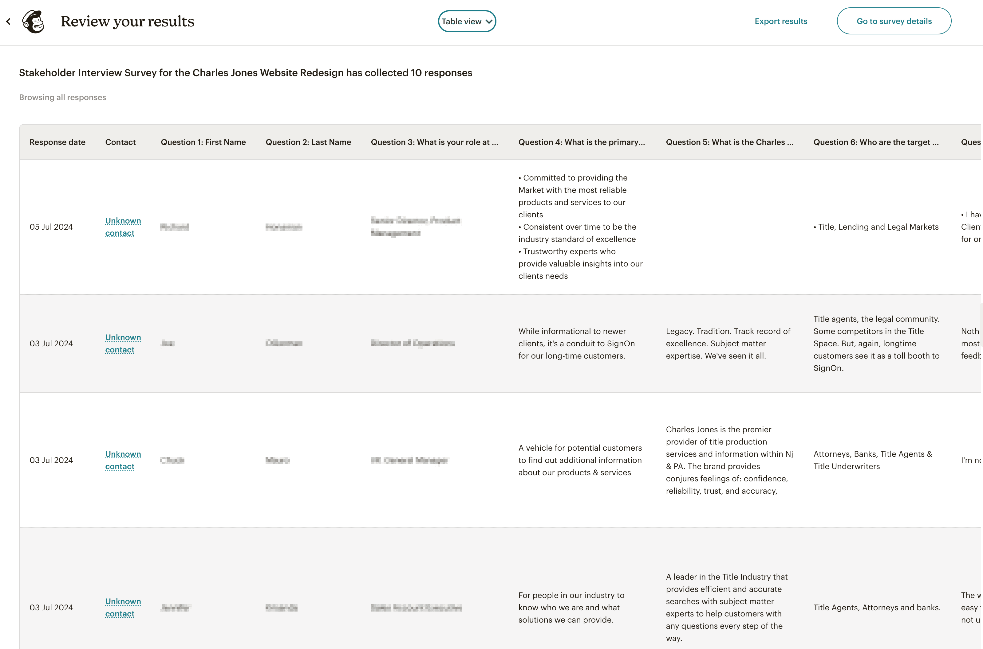
I conducted stakeholder interviews using MailChimp to collect insights, gain a full understanding of pain-points, and refine project objectives.
Accessibility Audit
I used a third-party tool to audit the accessibility of the website. There were many issues found which I created a remediation plan for outlined in the Foundation Report.
Define
Target Audiences
I identified audiences based on the user research and stakeholder interviews. These audiences were:
Audiences:
Law Firms
Financial Institutions
Real Estate Agencies
Title Companies
Surveyors
Corporations / In-House
Common Goals:
Purchase due diligence public records
Make an informed decision
Common Tasks:
Research a solution’s reliability, speed, and quality
Compare solution with competitor’s offerings
Provide research to decision-makers / cost center owner
Develop
Developing Solutions
Wireframes
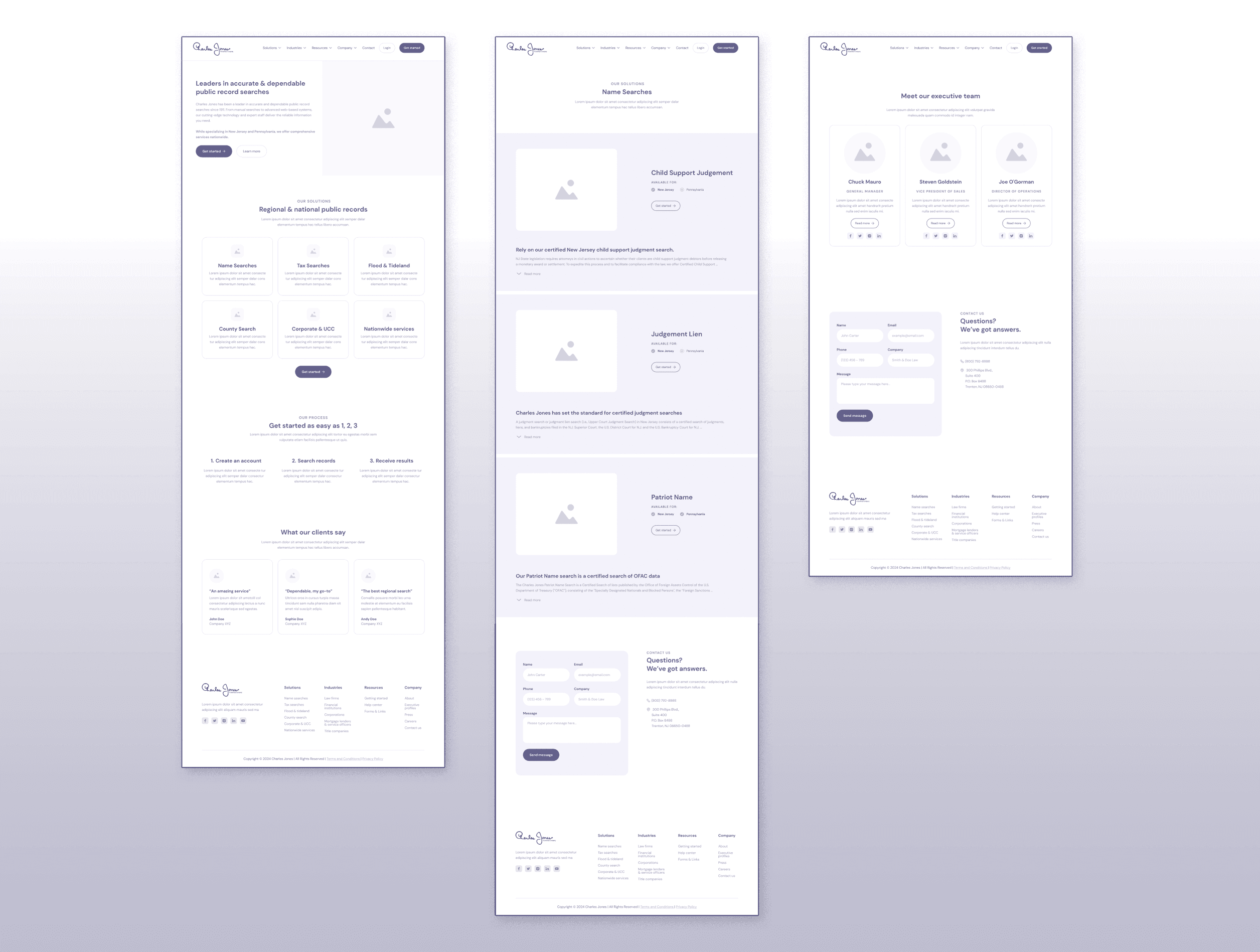
I created wireframes to craft a layout and page structure that would resolve the issues found in the audit as well as meet the redesign goal.
The website lacks a consistent layout and theme, resulting in an inconsistent user experience. This inconsistency significantly affects the discoverability of content, making it challenging for first-time or infrequent visitors to quickly find what they need. Resolving this was a top goal for the redesign.
Information Architecture and Navigation
The old navigational structure did not adhere to best practices for content organization, negatively impacting search engine optimization (SEO) and overall website usability. Additionally, it did not help visitors to quickly view what pages, or sections, were available. The navigation also was visually small and truncated which gave the appearance limited offerings. There were also links to pages not in the primary navigation which could only be accessed via the homepage.
Based on my research, which included a competitive analysis, I created a new information architecture and site structure that helped users quickly find what they were looking for. Also, I created the groundwork for conversion funnels, onboarding, and a resource library.
Deliver
Final Designs & Handoff
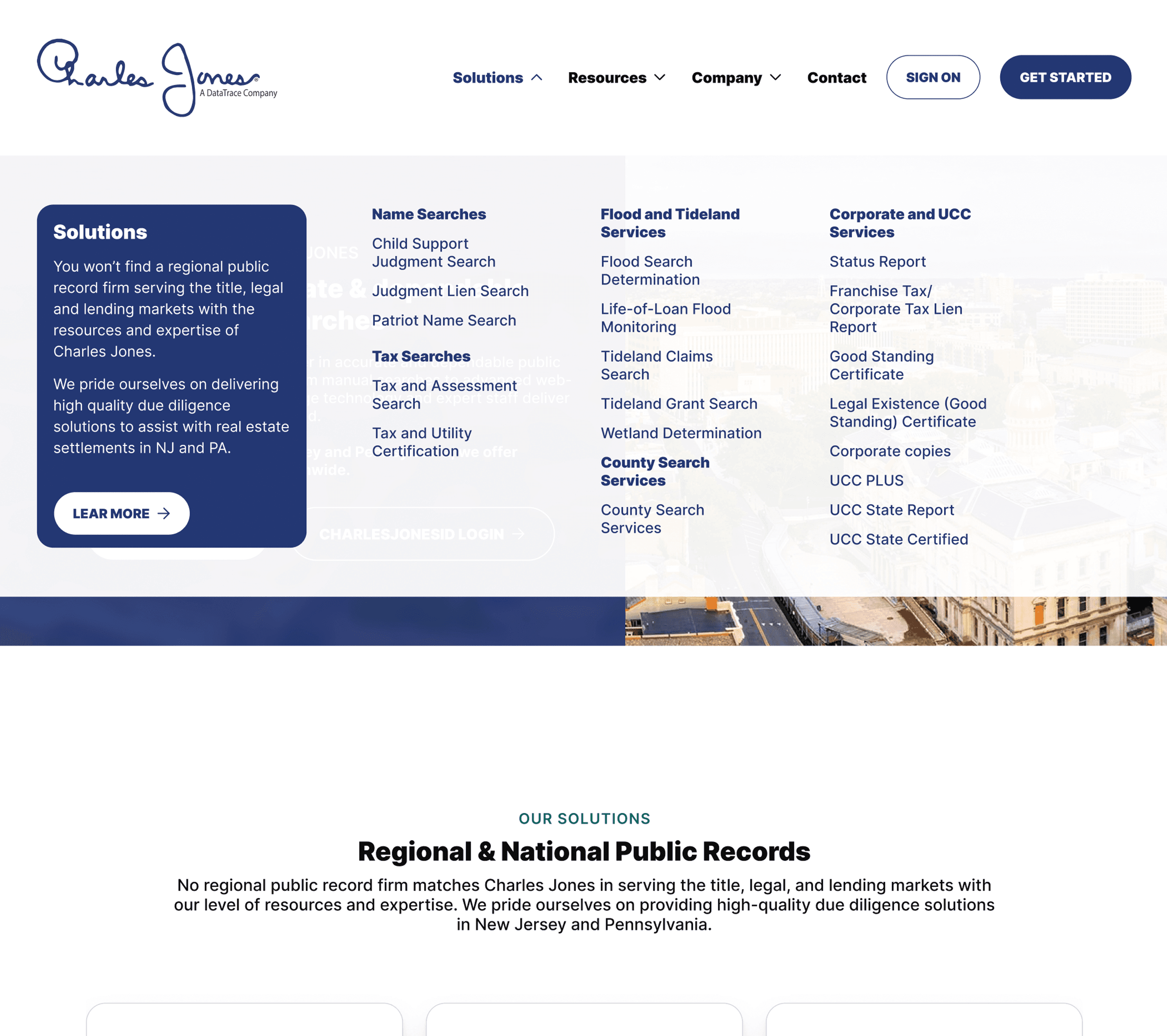
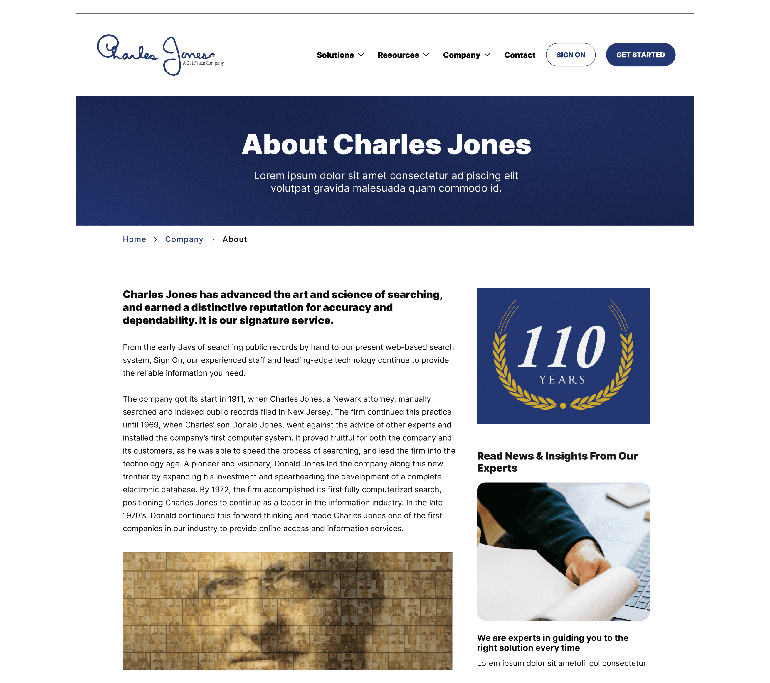
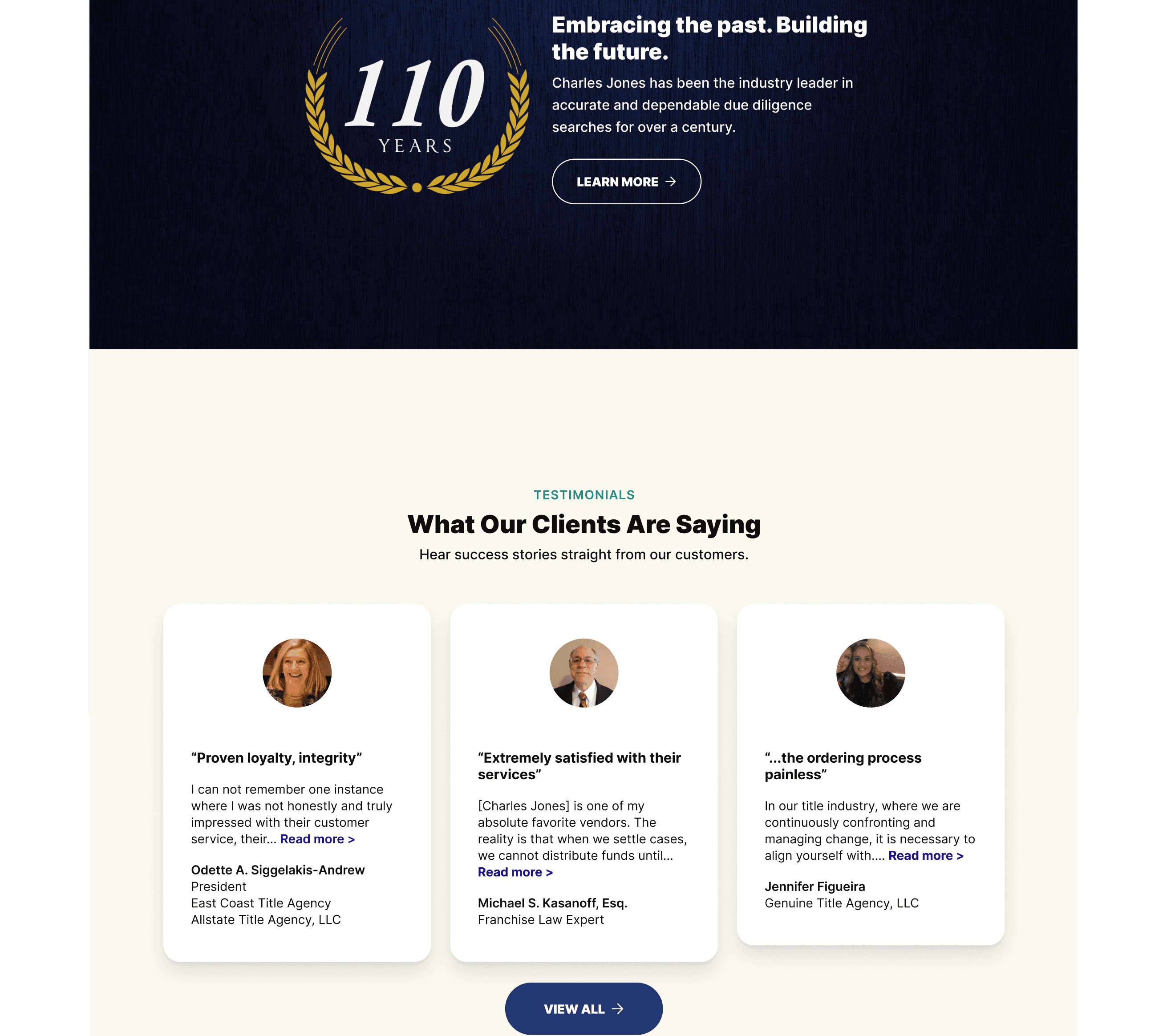
The final design created much needed visual hierarchy that helped users quickly understand Charles Jone's offerings, where to logon, and how to start using their services.
Additionally, for each service type, I moved away from specific images in favor of icons. My reasoning was that while images are impactful, they left too much room for interpretation. Whereas icons are more neutral, easier to be adopted as part of the branding, and more effective to help users identify sections as they scan a page.
Lessons learned
The Charles Jone development team had limited time and resources to build the redesign as mocked up. So, they worked to deliver the most important parts of my recommendations. This also included a single multipurpose login/account creation page, page-level CTA component, flexible page structures, and navigational structure.
Lastly, we used Figma DevView to accelerate the handoff process. This was my recommendation as part of the project proposal and I created the Figma mockup with this in mind. Meaning well structured layouts using Auto Layout and making sure margins and padding were consistent.
You can check out the live site here charlesjones.com
